Modifying pixel plots
The plotPixels function in colordistance is pretty inflexible. It was originally meant as a diagnostic tool, and the plots it produces are not exactly beautiful:
library(colordistance)

# image from the 'recolorize' package (github.com/hiweller/recolorize)
img <- system.file("extdata/fulgidissima.png", package = "recolorize")

# load the image:
loaded_img <- loadImage(img)

# set the plot layout for opposing pixel plots
layout(matrix(1:3, nrow = 1), widths = c(0.46, 0.08, 0.46))

# plot the pixels in RGB color space from two angles:
plotPixels(loaded_img)

# plot the original image
par(mar = rep(0, 4)) # no margin
plotImage(loaded_img)

# and pixels from the opposite angle:
plotPixels(loaded_img, angle = -45)
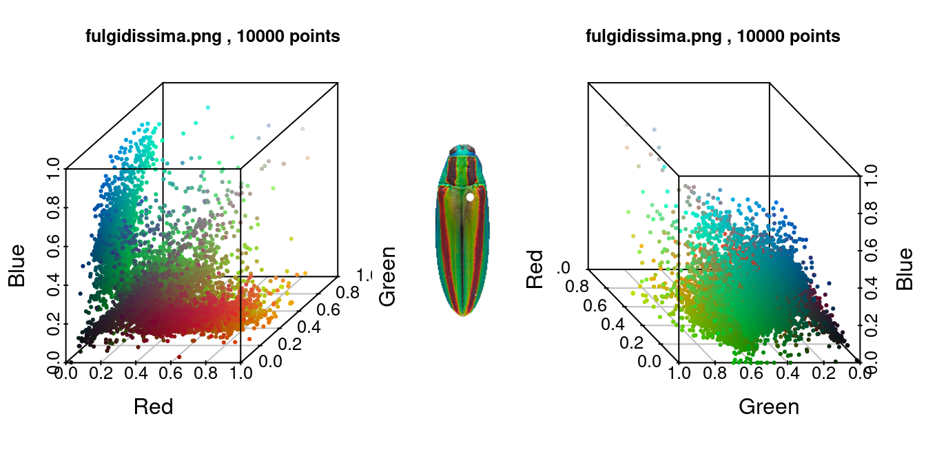
These plots are certainly fine if you want to scope out the color distribution in the image, but I wouldn’t want to display them for communication: the axis text is too large and some of the tick marks overlap; the axis labels are oddly spaced; and depending on the intention of the graphic, I might not want the grid or the plot frame. The axis label thing in particular has always bothered me.
Some of those changes are possible to make by passing additional parameters to the plotPixels function itself, but in practice, I often want more flexibility than this provides. Luckily, the function itself has such simple building blocks that it’s pretty easy to unpack them to get more customized plots.
This is how plotPixels works:
- It takes a dataframe of RGB colors, where pixels are rows and color channels are columns.
- It creates a vector of hex codes from the RGB colors to tell R which color to make each point.
- It uses
scatterplot3dto plot in the 3D color space indicated with thecolor.spaceargument.
I chose the scatterplot3d package because, of all the 3D plotting packages, it’s the most lightweight, and more or less just extends the base plotting syntax. It was also written in 2003, so there are a lot of newer packages that provide prettier output and more options, like plot3D by Karline Soetaert, or the plotly library.
# load the plot3D library
library(plot3D)

# get the RGB pixel matrix
pixels <- loaded_img$filtered.rgb.2d

# make the hex color vector using the rgb() function
color_vector <- rgb(pixels); head(color_vector) # just a bunch of hex codes!
## [1] "#247872" "#006862" "#006B62" "#00776A" "#00645C" "#007B71"
# use the scatter3D function
scatter3D(x = pixels[ , 1],
          y = pixels[ , 2],
          z = pixels[ , 3],
          colvar = 1:nrow(pixels), # <- note we have to make a fake 'variable' to assign each pixel a different color
          col = color_vector,
          colkey = FALSE, # gets rid of the (in this case meaningless) legend
          xlab = "Red", ylab = "Green", zlab = "Blue")
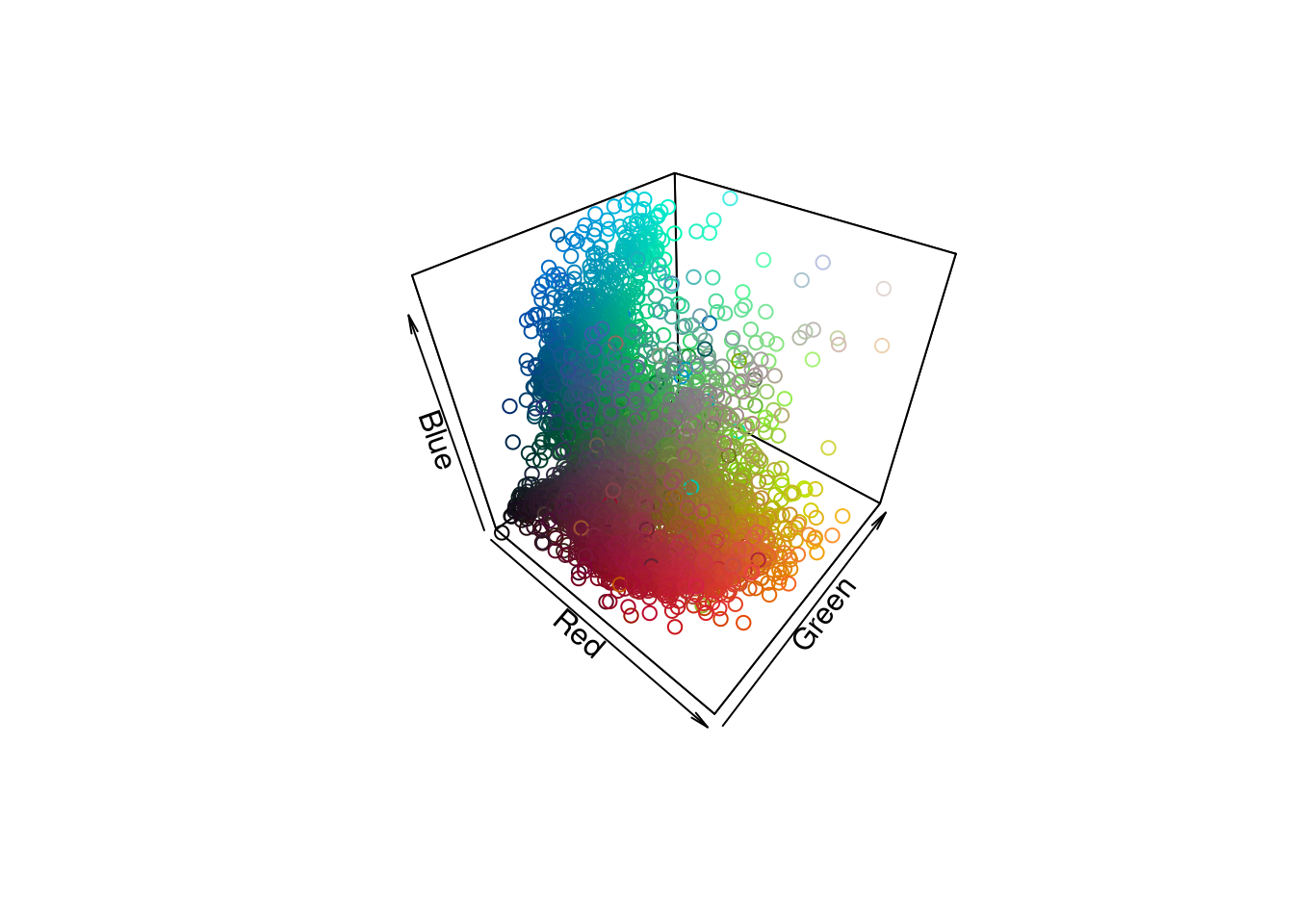
Even the default scatter3D plot looks a lot better to me: the axis labels hug the axes, and the angle is nicer. We can get fancier with a lot of the options, too:
scatter3D(x = pixels[ , 1],
          y = pixels[ , 2],
          z = pixels[ , 3],
          colvar = 1:nrow(pixels),
          col = color_vector, colkey = F,
          xlab = "Red", ylab = "Green", zlab = "Blue",
          xlim = 0:1, ylim = 0:1, zlim = 0:1, # RGB max and min
          pch = 19, # filled circles
          alpha = 0.5, # partially transparent
          theta = 115, phi = 25, # change viewing angle
          bty = "bl2") # black grid background looks sort of cool
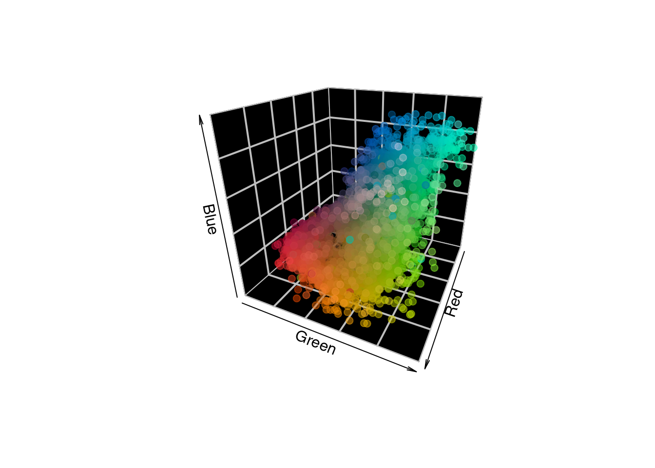
What if you want to plot in another color space besides RGB? The only difference is that you have to first convert your pixel matrix to a given color space, for which you have several options.
# convert pixels to CIE Lab coordinates
pixels_lab <- convertColor(pixels, from = "sRGB", to = "Lab")

# color vector remains the same!
color_vector <- rgb(pixels)

scatter3D(x = pixels_lab[ , 1],
          y = pixels_lab[ , 2],
          z = pixels_lab[ , 3],
          colvar = 1:nrow(pixels_lab),
          col = color_vector, colkey = F,
          xlab = "Luminance", ylab = "a (red-green)", zlab = "b (yellow-blue)",
          theta = 120, phi = -5,
          xlim = c(0, 100),
          pch = 19, # filled circles
          alpha = 0.5, # partially transparent
          bty = "b2")
As an aside, it’s good practice to set the axis limits thoughtfully. This is easy with RGB: all three channels have a 0-1 range. With CIE Lab, this depends on your reference white. The L channel will always be 0-100, and the outer limits for the a and b channels are -127 to 128 each, but for a given reference white converting from sRGB it will be a subset within that range. The axis limits will be set to the range of the data by default, which could be misleading if you’re comparing plots of multiple images.
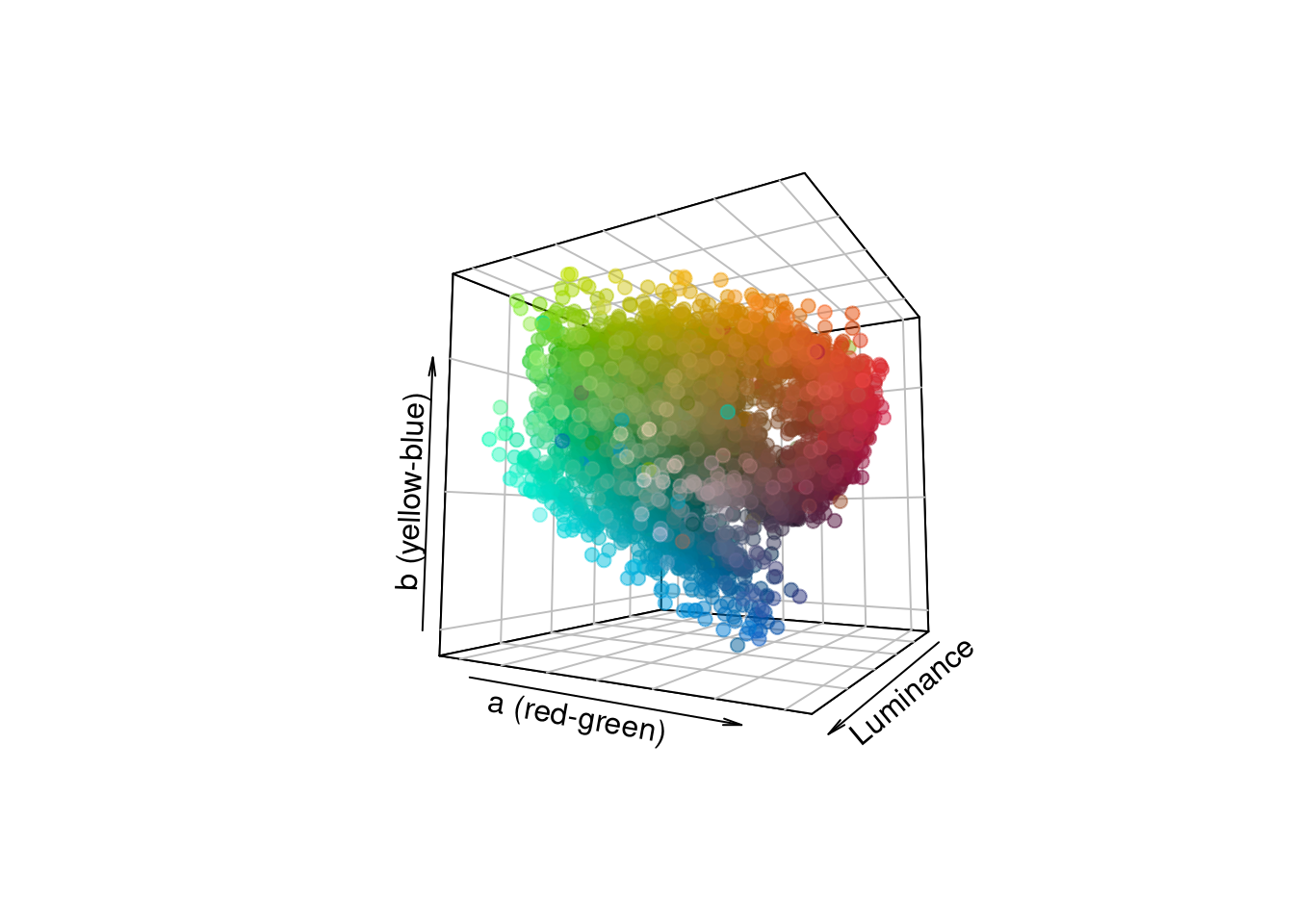
If you’d rather have an interactive plot (especially helpful for data exploration), you can use the plotly package. I find I have to implement more workarounds to get these plots to behave how I’d expect, but once you get out an interactive plot, it’s pretty slick:
library(plotly, quietly = TRUE)

# let's subsample down to 100 pixels just for this example
pixel_sub <- as.data.frame(pixels[sample(1:nrow(pixels), 100), ])
plotly_colors <- rgb(pixel_sub)

# and plot!
plot_ly(data = pixel_sub,
        x = ~r, y = ~g, z = ~b,
        type = "scatter3d", mode = "markers",
        color = I(plotly_colors), # this is a bit of a hack and you'll get a warning...
        colors = plotly_colors)
If you play around with this enough, you’ll realize that plotting all of your 3D data on a plot as individual points is kind of cumbersome when you have thousands of points; you can’t really tell which regions of your color space are more or less dense. It may better suit your purposes to cluster the data a bit first, and then plot the clusters:
clusters <- extractClusters(getKMeanColors(img, color.space = "Lab",
                                           ref.white = "D65",
                                           n = 50, plotting = F))
colnames(clusters) <- c("L", "a", "b", "Pct")

# We can do this with a colordistance function...
scatter3dclusters(clusters, color.space = "lab", scaling = 100)
# we can also use scatter3D, with a bit of a hack to get different point sizes
col_vector <- rgb(convertColor(clusters[ , 1:3], from = "Lab", to = "sRGB"))

# make blank plot
scatter3D(clusters$L, clusters$a, clusters$b,
          cex = 0, colkey = F, phi = 35, theta = 60,
          xlab = "L", ylab = "a", zlab = "b")

# set scale multiplier for point sizes
scale <- 80

# add one point at a time, setting size with the cex argument
for (i in 1:nrow(clusters)) {
  scatter3D(x = clusters$L[i],
           y = clusters$a[i],
           z = clusters$b[i],
           cex = clusters$Pct[i] * scale,
           pch = 19, alpha = 0.5,
           col = col_vector[i], add = TRUE)
}
# or, we can just use plotly again
plot_ly(data = clusters,
        x = ~L, y = ~a, z = ~b,
        type = "scatter3d", mode = "markers",
        color = I(col_vector), # this is a bit of a hack and you'll get a warning...
        colors = col_vector, size = ~Pct)