Using the dichromat package to check if your plot is colorblind-friendly
The goal of this post is to demonstrate how I use the dichromat R package to check if my custom color palettes are colorblind-friendly.
A lot has been written about choosing colorblind-friendly color palettes when visualizing data, and I won’t rehash here why it’s important. Honestly, the colorblind scientists I know tend to be pretty pragmatic about this problem (most of them will tell me a version of “I can usually figure it out from context”), and I do think that folks can get a little intense about this particular aspect of visual accessibility, sometimes at the expense of other aspects. But since choosing colorblind-friendly palettes is easy, I don’t see why we shouldn’t do it any time color is being used to indicate something on a graph.
A lot of the advice that I run into when I’m trying to choose a color palette reduces down to three general categories: 1) use a pre-generated palette that has been carefully checked for being distinguishable for all the most common types of colorblindness, 2) rules of thumb like “stay away from green and orange,” or 3) print it out in black and white and/or run your graph through an online color blindness simulator to see if it looks okay. Personally, I find the second one too vague, the third one too cumbersome for tweaking, and the first one too inflexible when I want the colors to represent something specific, like habitat type. If you are also stubborn and detail-oriented, you know what I mean.
As for the dichromat package: nothing I write here is prescriptive! But this is an option I happen to use a lot, and the dichromat package has been incredibly useful for me in this context, so I wanted to show how I use it.
The dichromat package
The main function of the dichromat package is dichromat (I love when packages do this), and it approximates the effects of three of the most common forms of color blindness.
library(dichromat)
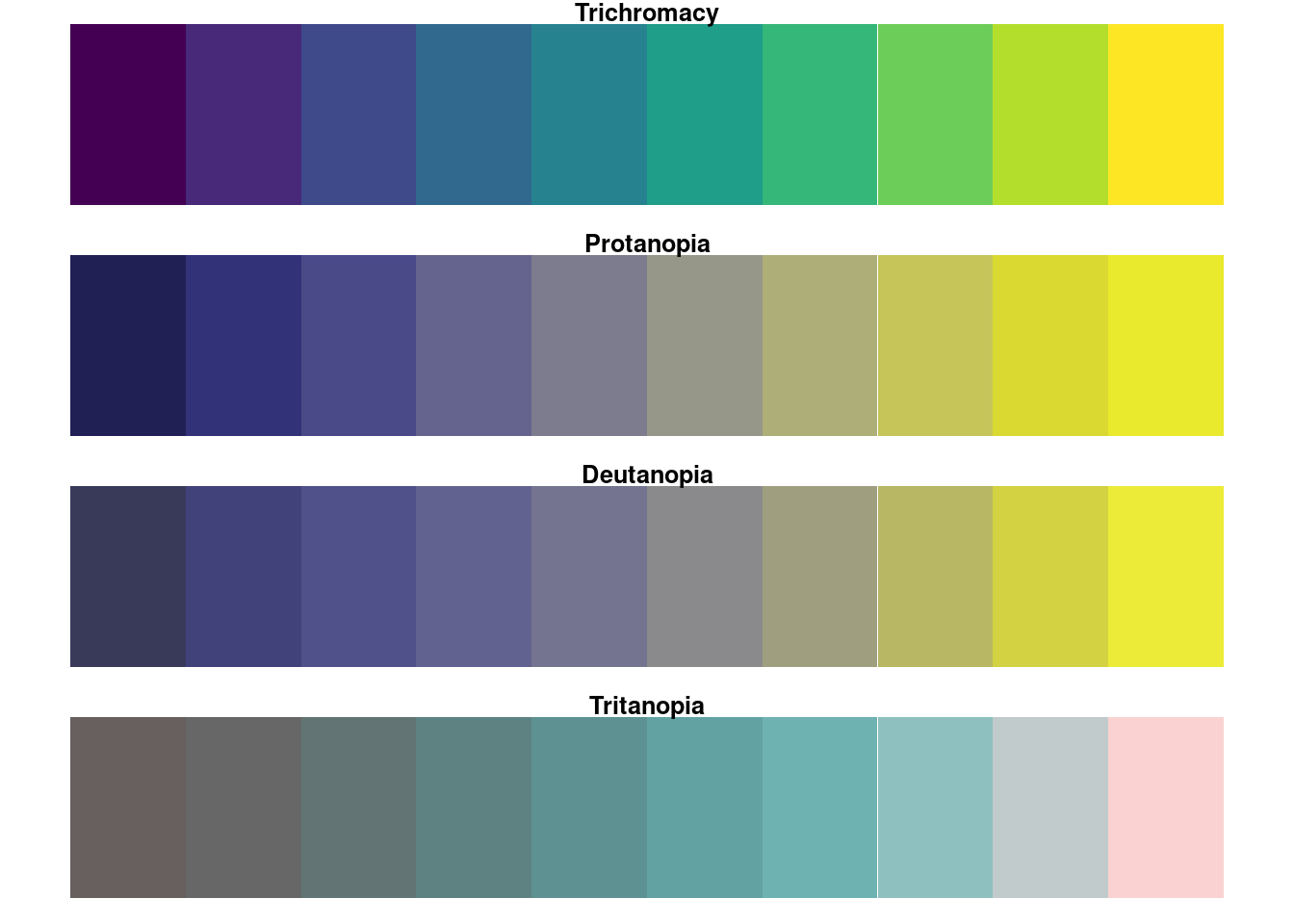
red_green_colors <- RColorBrewer::brewer.pal(11, "RdYlGn")
# convert to the three dichromacy approximations
protan <- dichromat(red_green_colors, type = "protan")
deutan <- dichromat(red_green_colors, type = "deutan")
tritan <- dichromat(red_green_colors, type = "tritan")
# plot for comparison
layout(matrix(1:4, nrow = 4)); par(mar = rep(1, 4))
recolorize::plotColorPalette(red_green_colors, main = "Trichromacy")
recolorize::plotColorPalette(protan, main = "Protanopia")
recolorize::plotColorPalette(deutan, main = "Deutanopia")
recolorize::plotColorPalette(tritan, main = "Tritanopia")
Here I’m demonstrating the functions on a red-yellow-green color palette, which unsurprisingly is pretty terrible for red-green colorblindness (protanopia, or red-down, and deutanopia, or green-down).
For convenience if I’m tweaking colors, I’ll usually write a function to do this automatically:
check_cb <- function(palette, return_cb_palettes = FALSE, ...) {
# make an empty list
cb_palettes <- setNames(vector("list", length = 3),
nm = c("protan", "deutan", "tritan"))
# generate colorblindness approximations
for (i in 1:length(cb_palettes)) {
cb_palettes[[i]] <- dichromat::dichromat(palette, names(cb_palettes)[i])
}
# reset graphical parameters when function exits:
current_par <- graphics::par(no.readonly = TRUE)
on.exit(graphics::par(current_par))
# plot for comparison
layout(matrix(1:4, nrow = 4)); par(mar = rep(1, 4))
recolorize::plotColorPalette(palette, main = "Trichromacy", ...)
pnames <- c("Protanopia", "Deutanopia", "Tritanopia")
for (i in 1:3) {
recolorize::plotColorPalette(cb_palettes[[i]], main = pnames[i], ...)
}
if (return_cb_palettes) {
return(cb_palettes)
}
}
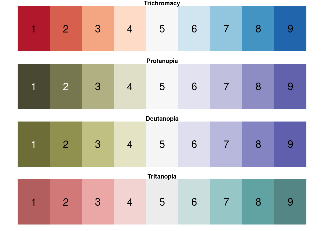
check_cb(RColorBrewer::brewer.pal(9, "RdBu"))
These are only simulations, and individuals vary in the type and severity of their colorblindness. In particular, these approximations are for types of color blindness where one of the cone types is completely absent, but it’s much more common for people to just have reduced sensitivity in one of these cone types (protanomaly, deuteranomaly, and tritanomaly). But as far as I’m aware, you can generally assume that if two colors are distinguishable to a protanopic viewer they will also be distinguishable to a protanomalous viewer, and so on.
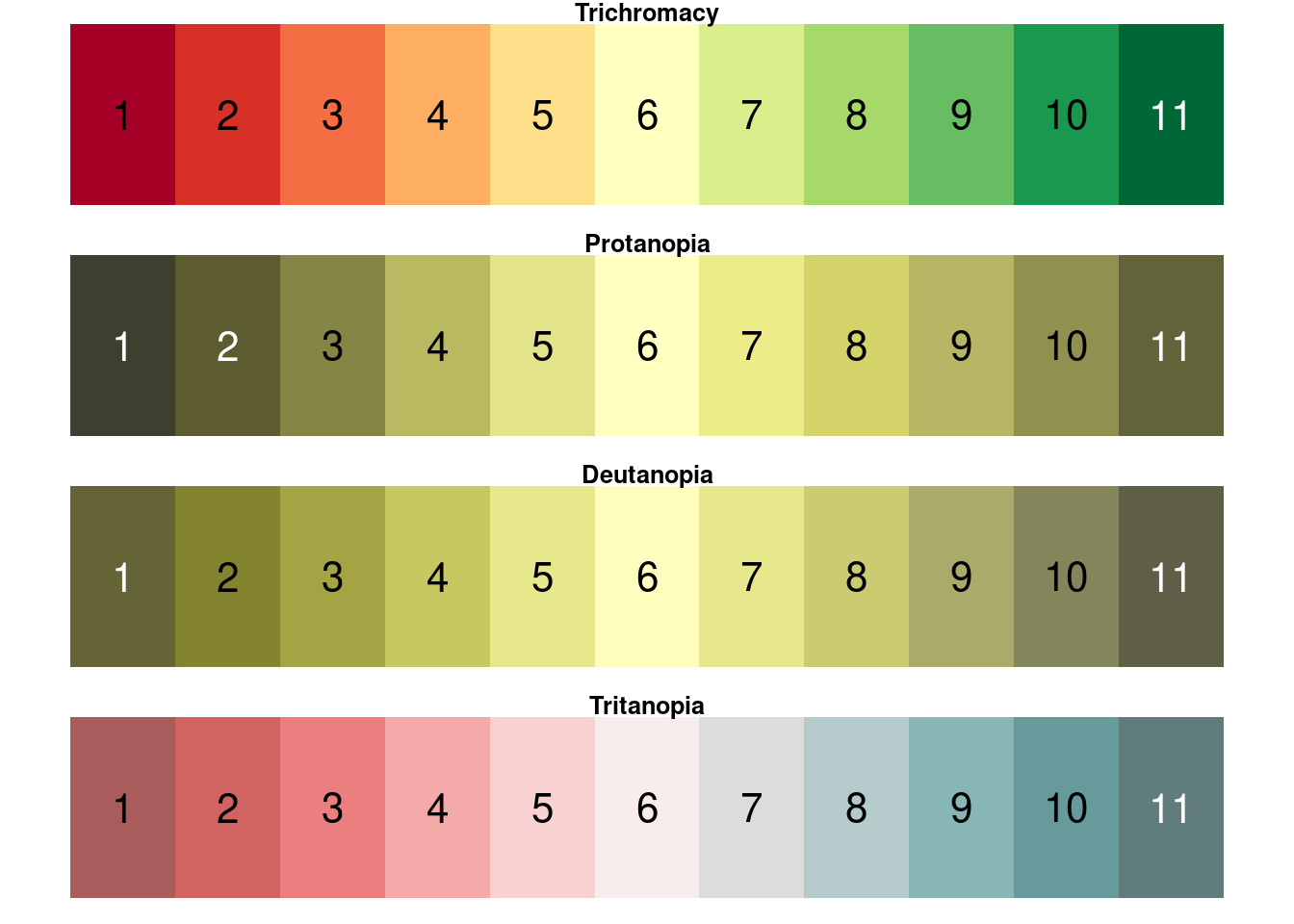
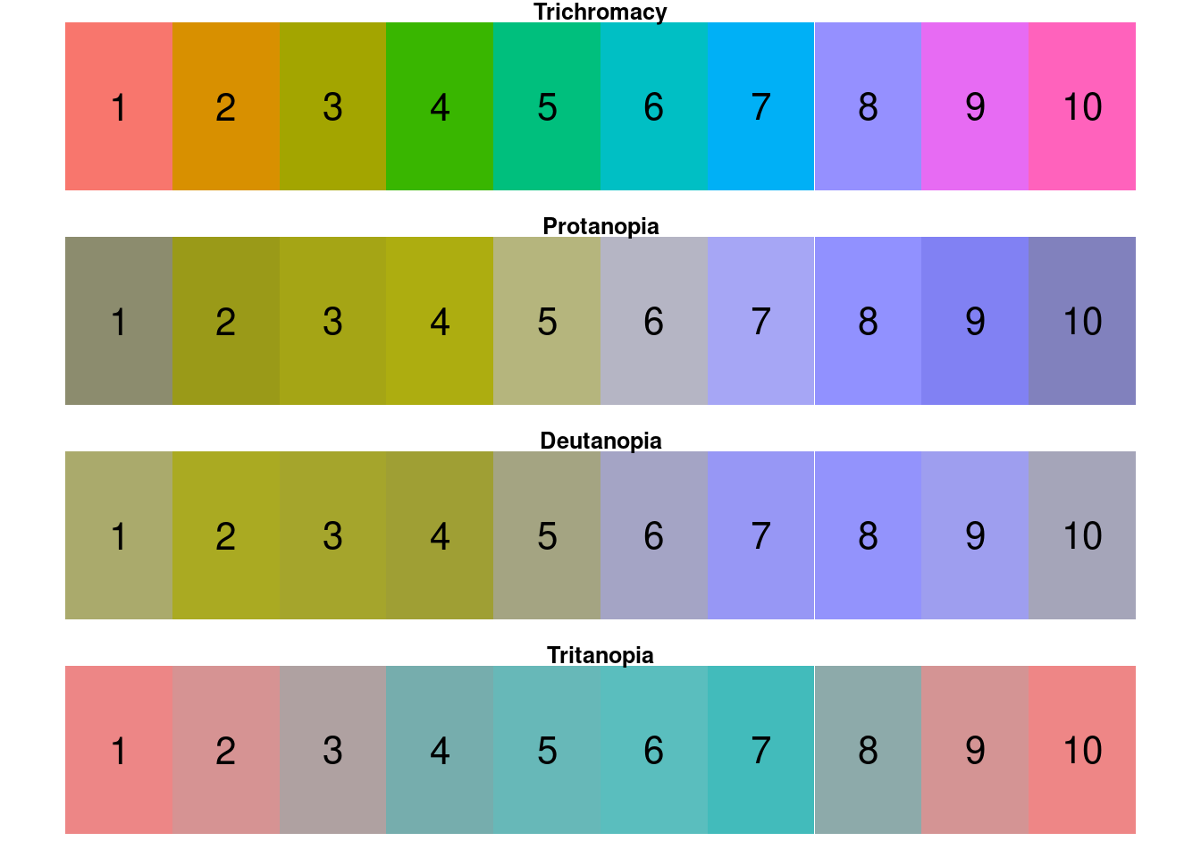
Still, although most of us would probably know to stay away from a red-green color palette, plenty of other common examples are just as egregious. For example, the default ggplot2 color scale is about the worst thing you could possibly use, because all of the colors vary only in hue and not at all in luminance:
ggplot_colors <- scales::hue_pal()(10)
check_cb(ggplot_colors)
To be fair, a lot of these are hard to distinguish for trichromatic viewers. (I don’t actually know why the developers chose this palette, but I actually wonder if it’s because it’s so obviously bad that they were hoping users would always change it to suit their needs?)
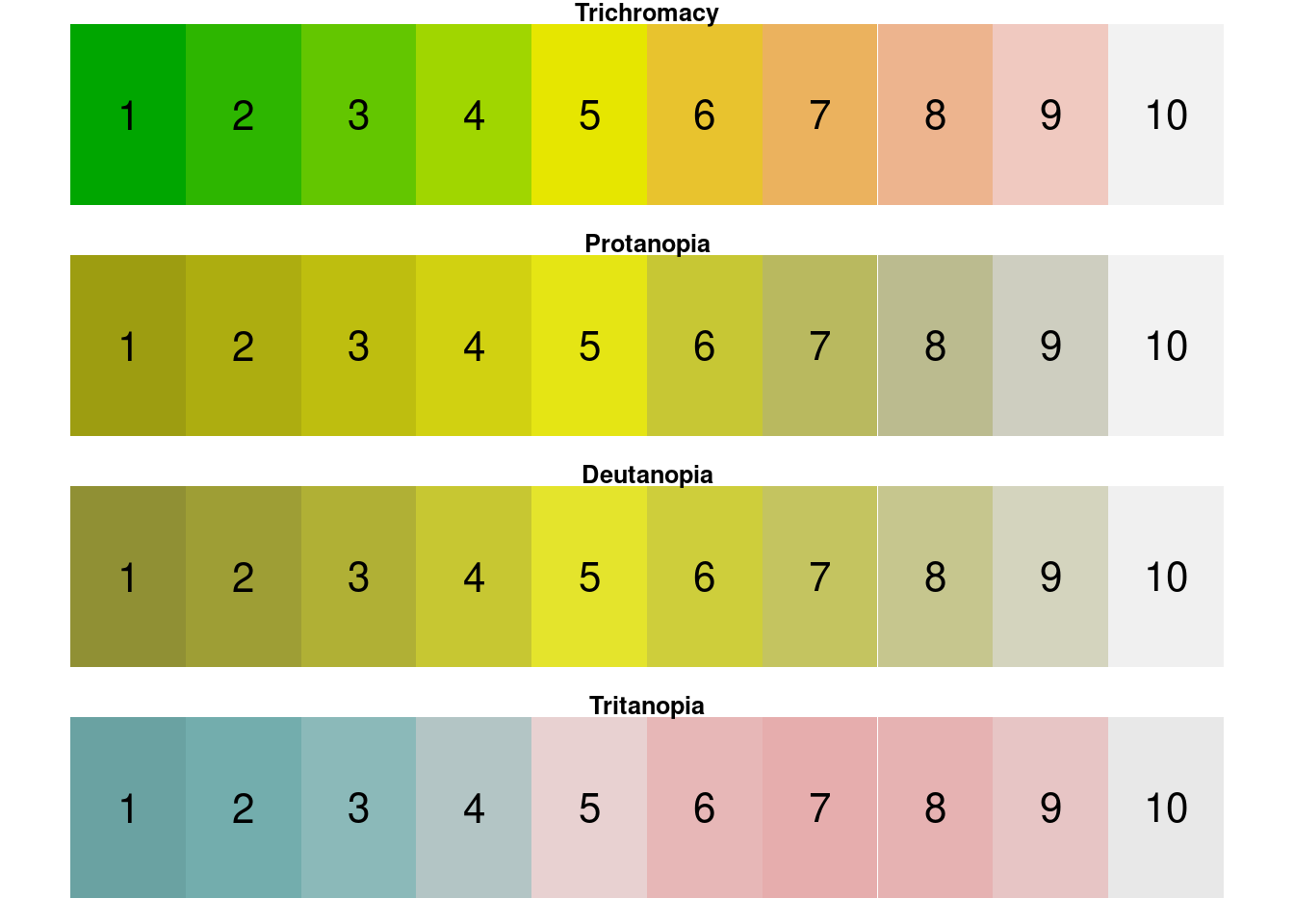
The terrain palette, mostly used for terrestrial maps, is also particularly bad:
terrain <- terrain.colors(10)
check_cb(terrain)
 The same is true of red-green-blue palettes, which are often the default when we need three colors:
# ggplot strikes again, but this time the colors look deceptively different for trichromats!
check_cb(scales::hue_pal()(3))
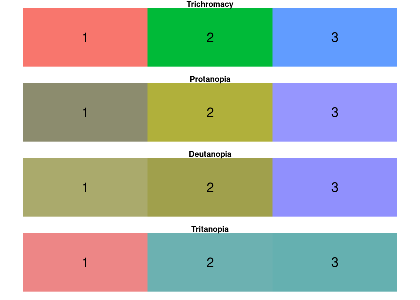 Let’s take this last example, because it’s one that I’ve run into a version of many times. Let’s say it’s the standard in your field to represent something with red, green, and blue (e.g. rotational axes). You don’t have to just stay away from red and green as a rule—you just need to tweak the particular colors you use so that something other than color distinguishes them. In practice the easiest thing is usually the brightness of the color.
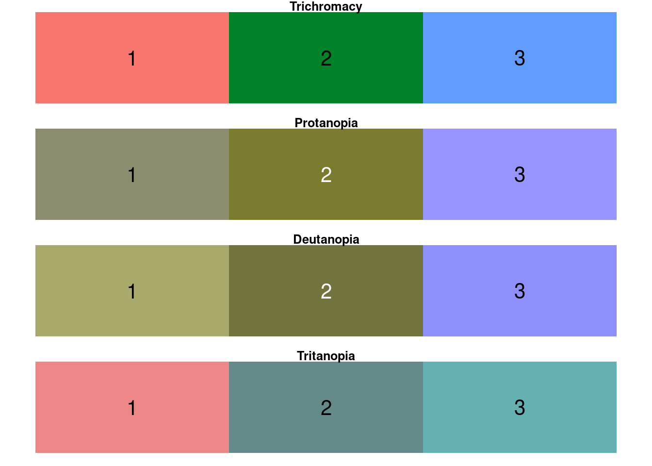
# convert to an RGB matrix:
original_rgb <- t(col2rgb(scales::hue_pal()(3)) / 255)

# decrease brightness of green:
tweaked_rgb <- recolorize::adjust_color(original_rgb, which_colors = 2,
                                        brightness = 0.7)
tweaked_rgb <- rgb(tweaked_rgb)

# check again - looks much better
check_cb(tweaked_rgb)
Sometimes even color palettes that intuitively seem like they should be really robust to color blindness turn out not to be! For example, check out red vs. a medium (60%) grey:
red_grey <- c("#FF0000", "#636363")
check_cb(red_grey)
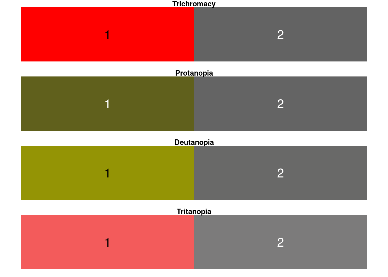 They’re not identical, but for protanopic viewers, they are very similar. I remember being taught a rule of thumb that any bright color + a greyscale value were pretty much always a safe combination, but if you are not sensitive to long-wavelength light, the difference between a deep red and a dark grey is not much. I didn’t realize this until I was navigating a digital interface where reserved spots where marked with grey and open ones with red, and the protanopic person I was with made a comment about wishing the interface had different colors for reserved seats!
Trying the color palettes out in your actual graphs
It’s perfectly reasonable to look at the last example and point out that although the red and grey colors for the protanopic viewer are very similar, they are not actually identical, and therefore you could get away with them. That’s true! This is where things start to get subjective. Personally, I find that I have to actually try the color palettes out in the graphs where I intend to use them. This is where the dichromat() function really comes in handy, since you can just swap out the different color palettes.
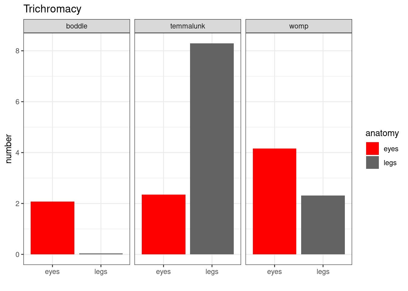
Sometimes the color is redundant with some other way that information is arranged—in that case, it doesn’t really matter if your color palette is colorblind-friendly:
# create a dataset
# feat. creatures from Animal Land Where There Are No People (1897)
species <- c(rep("womp", 2),
            rep("boddle", 2),
            rep("temmalunk", 2))
anatomy <- rep(c("legs" , "eyes") , 3)
number <- abs(rnorm(6, 2, 2))
size <- abs(rnorm(6, 5, 2))
data <- data.frame(species, anatomy, number, size)

# graph
library(ggplot2)
p <- ggplot(data, aes(fill = anatomy, y = number, x = anatomy)) +
    geom_bar(position = "dodge", stat = "identity") +
    facet_wrap(~species) + theme_bw() +
    xlab("")

# trichomatic:
p + scale_fill_manual(values = red_grey) + ggtitle("Trichromacy")
# and protanopic:
p + scale_fill_manual(values = dichromat(red_grey, type = "protan")) + ggtitle("Protanopia")

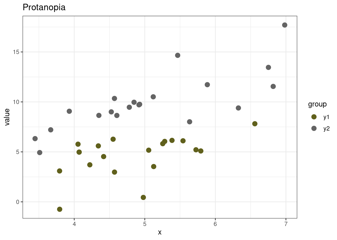
But in some cases, color is the only thing that identifies groups, so having near-identical colors actually makes it really hard to understand the graph:
x <- rnorm(40, 5)
df <- data.frame(x = x,
                 group = c(rep("y1", 20), rep("y2", 20)),
                 value = c(x[1:20] + rnorm(10, sd = 2),
                           x[21:40]*2 + rnorm(10, sd = 2)))

p <- ggplot(df, aes(x = x, y = value, color = group)) +
  geom_point(size = 3) + theme_bw()

p + scale_color_manual(values = red_grey) + ggtitle("Trichromacy")

p + scale_color_manual(values = dichromat(red_grey, type = "protan")) + ggtitle("Protanopia")
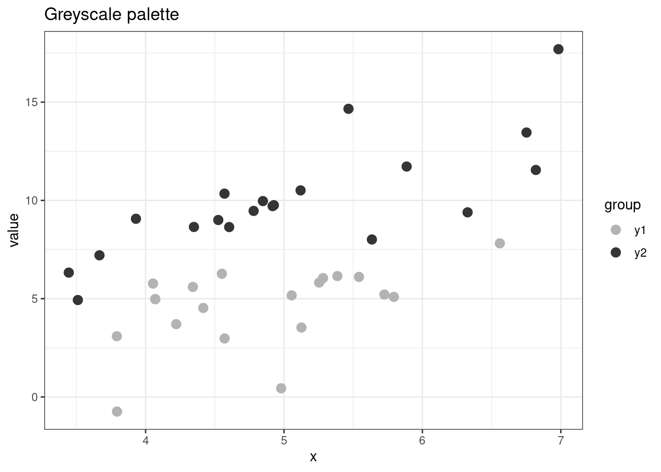
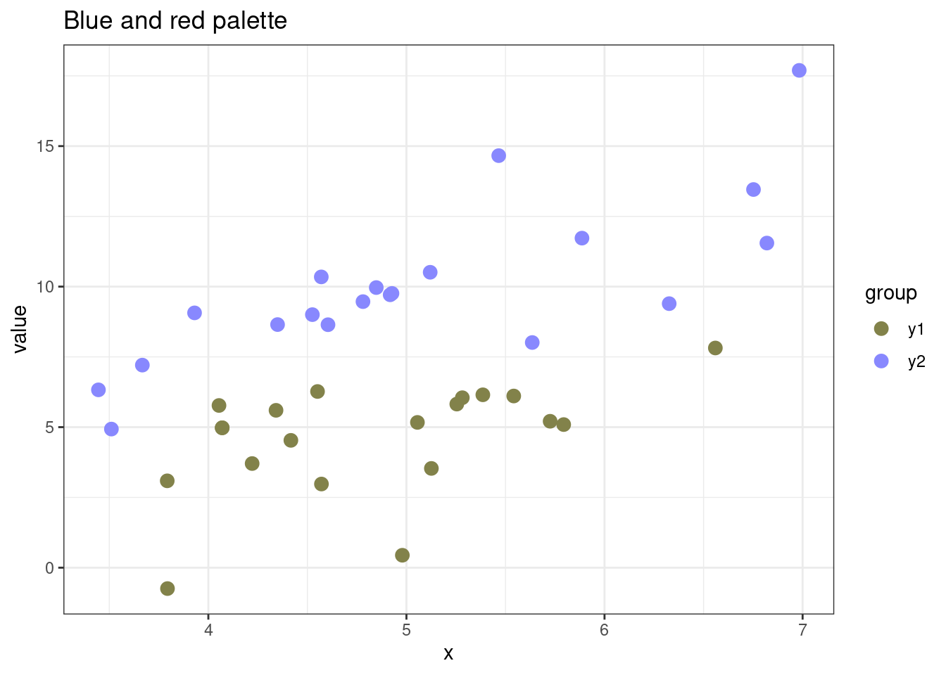
 Like I said—at this point, this is a subjective matter of how much you care about aesthetics and this particular form of accessibility. If I really wanted to use a red and grey color palette, I would choose a darker grey and a more orange-y red. If I just wanted two colors that are easy to distinguish, I would choose a light grey and a dark grey, or blue and red:
red_grey_2 <- c("tomato", "grey30")
grey2 <- c("grey70", "grey20")
red_blue <- c("tomato", "dodgerblue")

p + scale_color_manual(values = dichromat(red_grey_2, type = "protan")) + ggtitle("Altered red/grey palette")
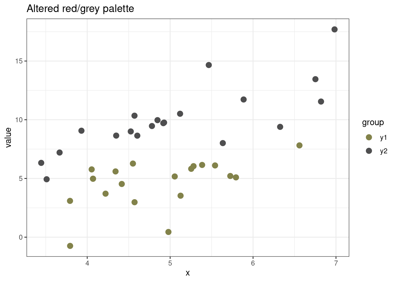
p + scale_color_manual(values = dichromat(grey2, type = "protan")) + ggtitle("") + ggtitle("Greyscale palette")
p + scale_color_manual(values = dichromat(red_blue, type = "protan")) + ggtitle("Blue and red palette")
Feel free to try out the above code using the other two types of color blindness—I found they still made the two groups easy to distinguish.
But with all that said, I don’t think that this in particular is worth agonizing about too much. You’ll always be able to find some advice that this color combination or that one is totally unacceptable, whether it’s because they are not colorblind-friendly, or not perceptually uniform, or won’t print out well for a greyscale printer. At a certain point you have to declare something is good enough for a reasonable viewer, move on, and brace for whatever reviewer pet peeve you happen to encounter.
Summary
Use the
dichromat()function in thedichromatR package to convert a color palette to approximations of how it would be seen by three types of color blindness.Try the resulting colorblind approximation color palettes out in the graphs you intend to make.
If you discover that your chosen colors don’t work well for your intended purpose, try increasing the contrast in brightness between the colors by making one much darker or lighter.
When in doubt, just use the viridis palette!
check_cb(viridisLite::viridis(10), cex_text = 0)