One of the most direct ways to tell whether or not your image analysis is working is to plot your images themselves as points in your result plots, which is usually easier said than done. Lots of packages in R will allow you to do some form of this, but I usually run into two problems: 1) I have to download a (sometimes pretty hefty) package for a single function, and 2) that function often only works in a specific context, which means it’s not very flexible. In practice, I usually end up defining functions for this as-needed, in a sort of ad-hoc dirtbag fashion. This post will outline the basics of doing just that.
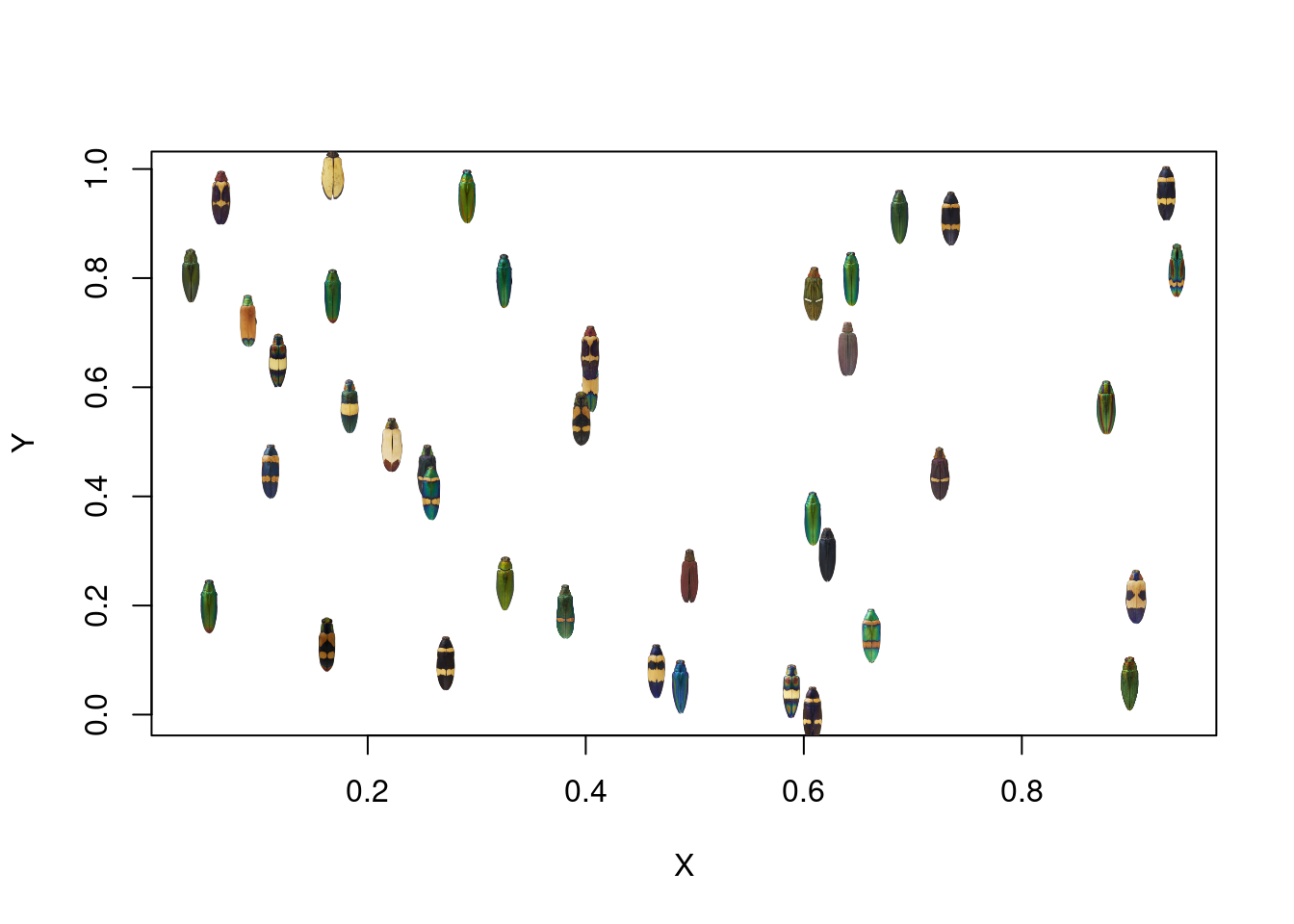
First, let’s take a look at our images:
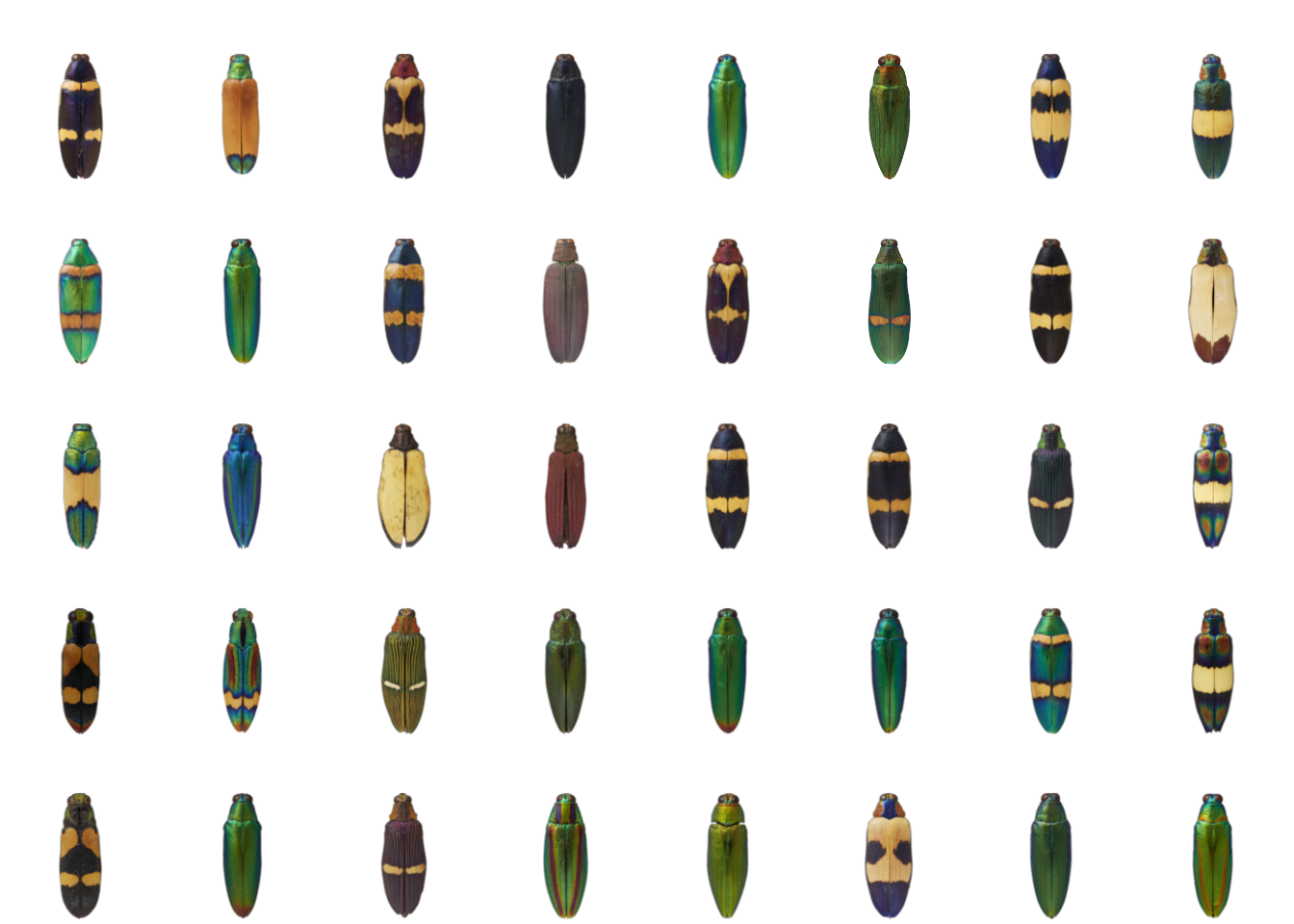 This is a lovely set of 40 images of jewel beetles, taken by my collaborator Nathan P. Lord. Not only are they all nicely uniform and centered, but the backgrounds are transparent – this almost always makes for nicer plotting, because you don’t get big white corners when the images overlap. Although if you’re just using these plots as diagnostics instead of figures, it doesn’t really matter as long as it helps you understand your data better.
As an example of the kind of thing we might want to plot, we’ll use colordistance to generate a distance matrix of color similarity for the forty images above:
library(colordistance)

# in my case, I have a folder called 'images' which contains the 40 images,
# so 'images' is a vector of 40 paths
images <- dir("images/", full.names = TRUE)

# generate a distance matrix using all the package defaults
cdm <- imageClusterPipeline(images, sample.size = FALSE)
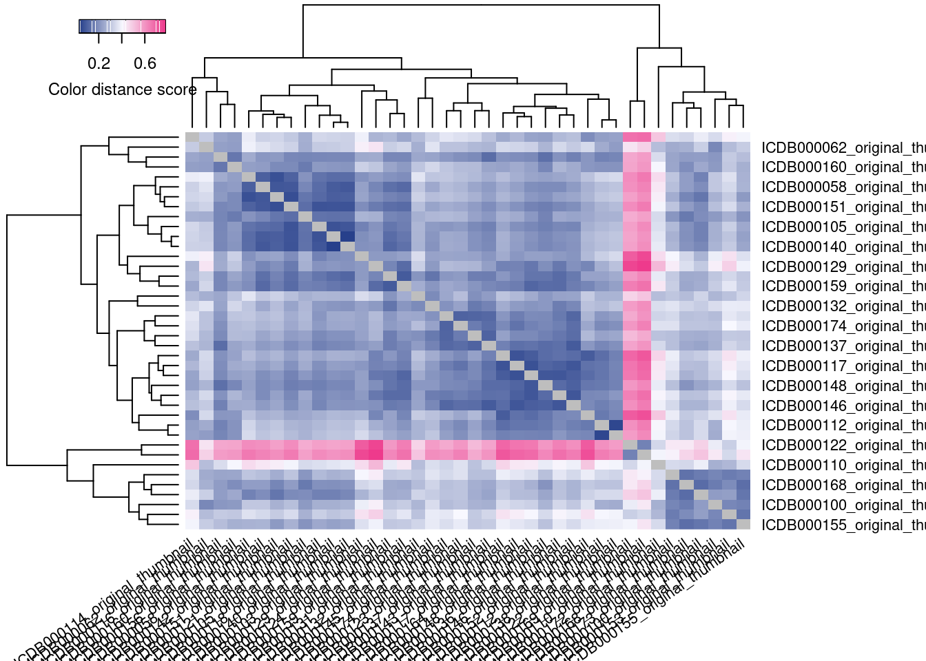 The idea of this analysis is to cluster the images with the most similar color palettes together. So, we want to know if the clusters produced by this distance matrix represent images that actually are the most similar-looking.
By default, colordistance generates a heatmap representing the pairwise color distances between each image, where darker blue indicates that two images are more similar, and brighter pink indicates that they are less similar. You might notice that this graphic is kind of useless for diagnostics. The image names are just printed as labels, and their names are not indicative of their contents–so I have no idea if this analysis has lumped together the green-and-shiny beetles separate from the black-and-yellow beetles, or if I need to try different settings, and sitting here looking up image names is not a quick way to check.
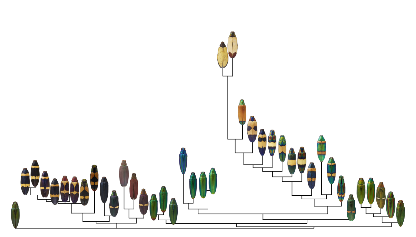
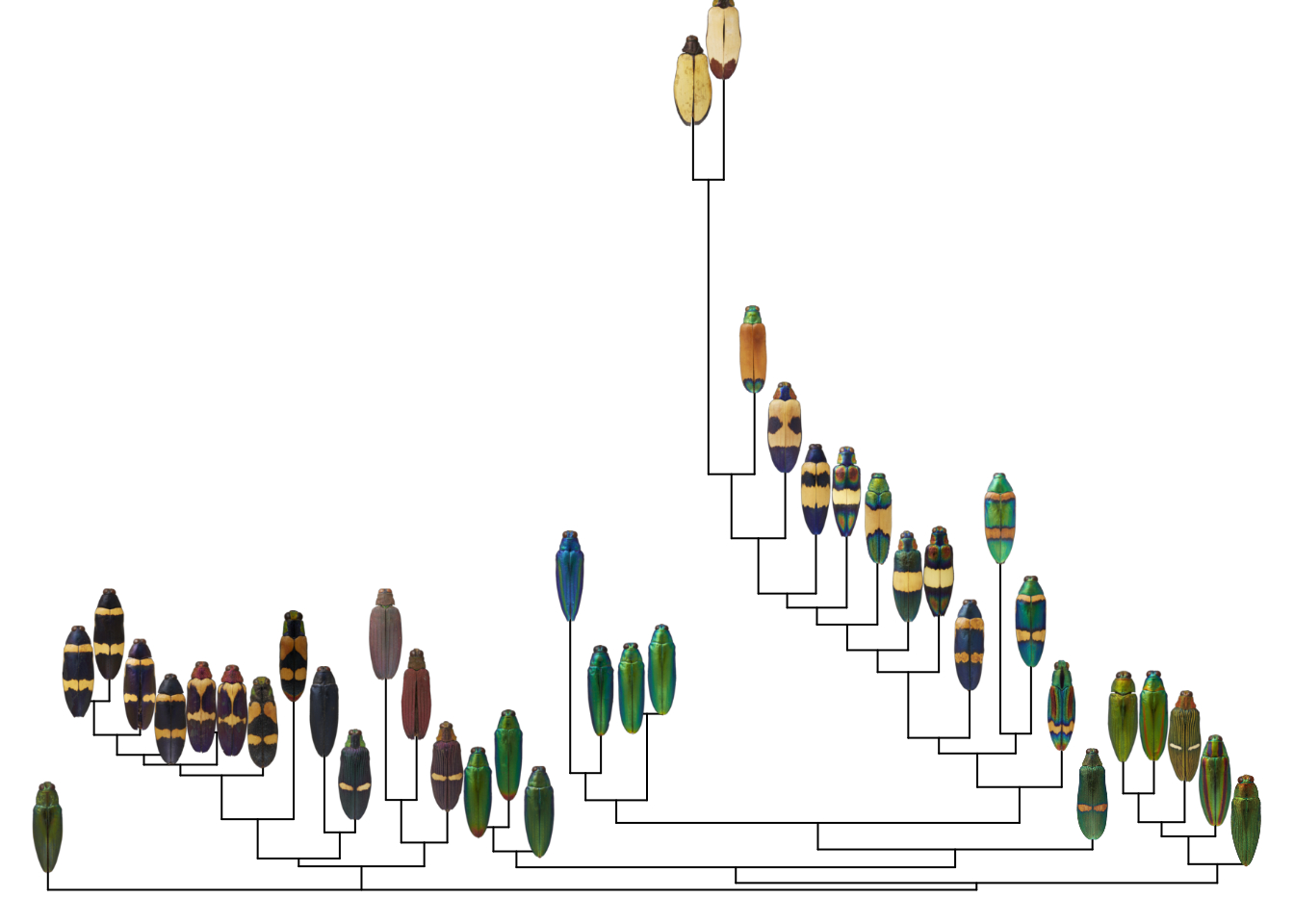
A better solution is to plot the images at the tips of the hierarchical clustering tree shown on the top and left of the heatmap:
To make this plot, I used the ape package to plot a neighbor-joining tree of the distance matrix, then defined a function for plotting images at the tips. First, let’s make the neighbor-joining tree:
library(ape)
tree <- nj(as.dist(cdm))
plot(tree, direction = "upwards", cex = 0.5)
Next, we can define a function, add_image, which adds an image to a plot at a given set of XY coordinates. It’s sort of analogous to the points function, which lets you add points to an existing base R plot.
This is more complicated than just plotting an image as an image, because we have to play nice with existing plotting parameters (aspect ratio, range of the X- and Y-axes, etc).
# define add_image function:
add_image <- function(obj, # an object interpretable by rasterImage
                      x = NULL, # x & y coordinates for the center of the image
                      y = NULL,
                      width = NULL, # width of the image
                      interpolate = TRUE, # method for resizing
                      angle = 0) {

  # get current plotting window parameters:
  usr <- graphics::par()$usr # extremes of user coordinates in the plotting region
  pin <- graphics::par()$pin # plot dimensions (in inches)

  # image dimensions and scaling factor:
  imdim <- dim(obj)
  sf <- imdim[1] / imdim[2]

  # set the width of the image (relative to x-axis)
  w <- width / (usr[2] - usr[1]) * pin[1]
  h <- w * sf # height is proportional to width
  hu <- h / pin[2] * (usr[4] - usr[3]) # scale height to y-axis range

  # plot the image
  graphics::rasterImage(image = obj,
                        xleft = x - (width / 2), xright = x + (width / 2),
                        ybottom = y - (hu / 2), ytop = y + (hu/2),
                        interpolate = interpolate,
                        angle = angle)
}
Note that if you just want to plot an image as an image, you can use rasterImage from the graphics package, and almost any other image analysis package will come with a plotting method (for example, in recolorize you can use plotImageArray).
We can use this function to plot the images on a regular XY plot:
X <- runif(40)
Y <- runif(40)
plot(X, Y)

for (i in 1:length(images)) {

  # read the image into R:
  img <- png::readPNG(images[i])

  # add the image:
  add_image(img, x = X[i], y = Y[i],
            width = 0.05)
}
If we wanted to actually plot the distance matrix as a bivariate plot, we could use non-metric multidimensional scaling (NMDS), as described in this post, to represent the distance matrix with a set of 2D coordinates:
# explaining NMDS is beyond the scope of this post (and is probably best left to the ecologists)
# see this link for more:
# https://cougrstats.wordpress.com/2019/12/11/non-metric-multidimensional-scaling-nmds-in-r/

# for now, we'll just do it in two lines!
library(vegan)
nmds_scores <- scores(metaMDS(comm = as.dist(cdm)))
## Run 0 stress 0.1158626
## Run 1 stress 0.1139447
## ... New best solution
## ... Procrustes: rmse 0.01705616  max resid 0.09840254
## Run 2 stress 0.1140722
## ... Procrustes: rmse 0.007575743  max resid 0.03447679
## Run 3 stress 0.1159785
## Run 4 stress 0.1158626
## Run 5 stress 0.1139448
## ... Procrustes: rmse 0.0001779728  max resid 0.0006533518
## ... Similar to previous best
## Run 6 stress 0.1158627
## Run 7 stress 0.115814
## Run 8 stress 0.1158626
## Run 9 stress 0.1139447
## ... New best solution
## ... Procrustes: rmse 6.912601e-05  max resid 0.0002514859
## ... Similar to previous best
## Run 10 stress 0.1139447
## ... Procrustes: rmse 5.642976e-05  max resid 0.0001733153
## ... Similar to previous best
## Run 11 stress 0.1140719
## ... Procrustes: rmse 0.007496018  max resid 0.03406593
## Run 12 stress 0.1139448
## ... Procrustes: rmse 9.99557e-05  max resid 0.000494275
## ... Similar to previous best
## Run 13 stress 0.1139447
## ... Procrustes: rmse 9.345179e-05  max resid 0.0004509194
## ... Similar to previous best
## Run 14 stress 0.1139447
## ... Procrustes: rmse 6.492366e-05  max resid 0.0003038437
## ... Similar to previous best
## Run 15 stress 0.1140722
## ... Procrustes: rmse 0.007604775  max resid 0.03440036
## Run 16 stress 0.1158141
## Run 17 stress 0.1158141
## Run 18 stress 0.1158142
## Run 19 stress 0.1139447
## ... Procrustes: rmse 5.046786e-05  max resid 0.0002452231
## ... Similar to previous best
## Run 20 stress 0.1158141
## *** Solution reached
plot(nmds_scores)
for (i in 1:length(images)) {

  # read the image into R:
  img <- png::readPNG(images[i])

  # add the image:
  add_image(img, x = nmds_scores[i, 1], y = nmds_scores[i, 2],
            width = 0.05)
}
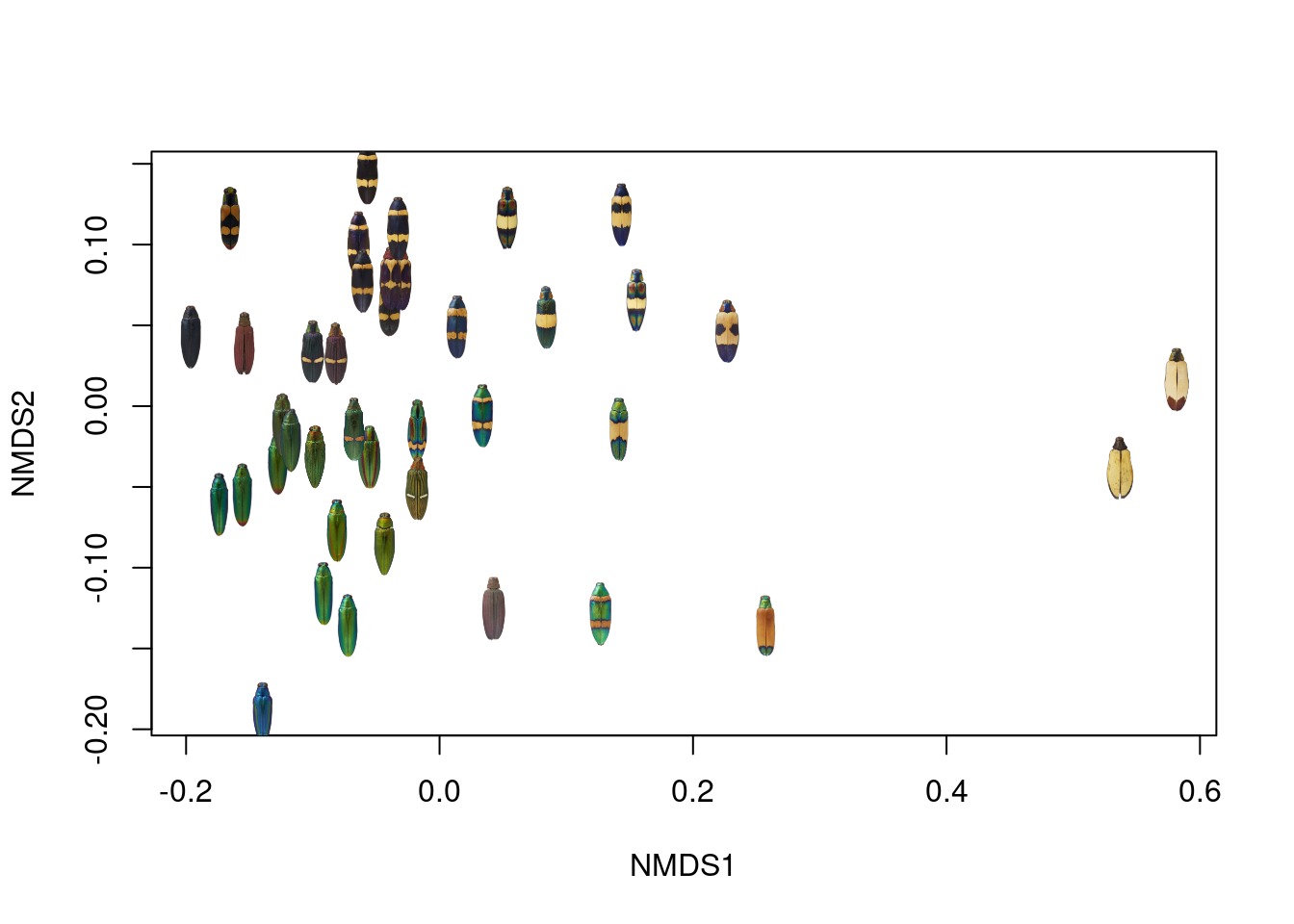
If this were a presentation-quality figure, I would probably bump out the X- and Y-axis ranges a bit so none of the images got cut off, but this looks pretty good!
However, I did promise plotting images at the tips of trees, and that turns out to be pretty easy once you’ve got a plotted tree and a set of tips. This mostly comes from this post on Liam Revell’s Phytools blog, which shows how to extract the XY coordinates of the tree tips from a plotted phylogeny; once we have those XY coordinates, we can plot images at those coordinates just as we would for a regular bivariate plot:
# plot the tree
plot(tree, show.tip.label = FALSE, direction = "upward")

# get the parameters from the plotting environment
lastPP <- get("last_plot.phylo", envir = .PlotPhyloEnv)

# get the xy coordinates of the tips
ntip <- lastPP$Ntip

# first n values are the tips, remaining values are the coordinates of the
# nodes:
xy <- data.frame(x = lastPP$xx[1:ntip],
                 y = lastPP$yy[1:ntip])

# we can add points to the tree pretty easily using generic functions:
points(xy[ , 1], xy[ , 2],
       col = viridisLite::viridis(40),
       pch = 19, cex = 2)
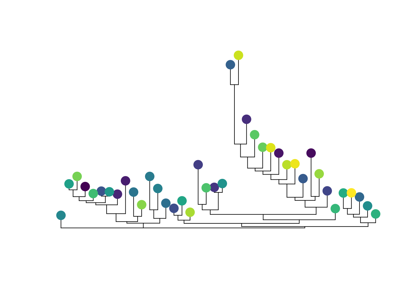
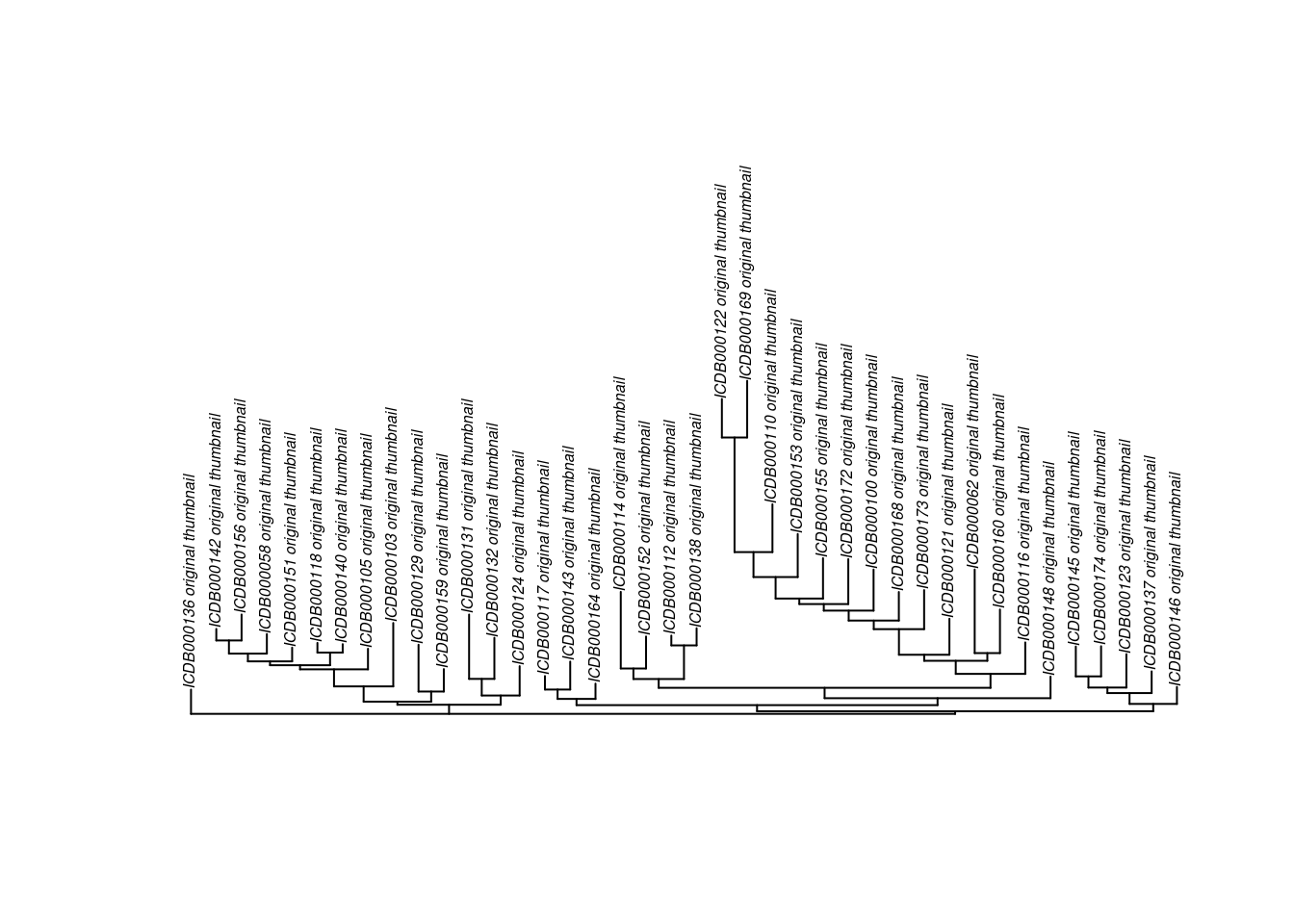
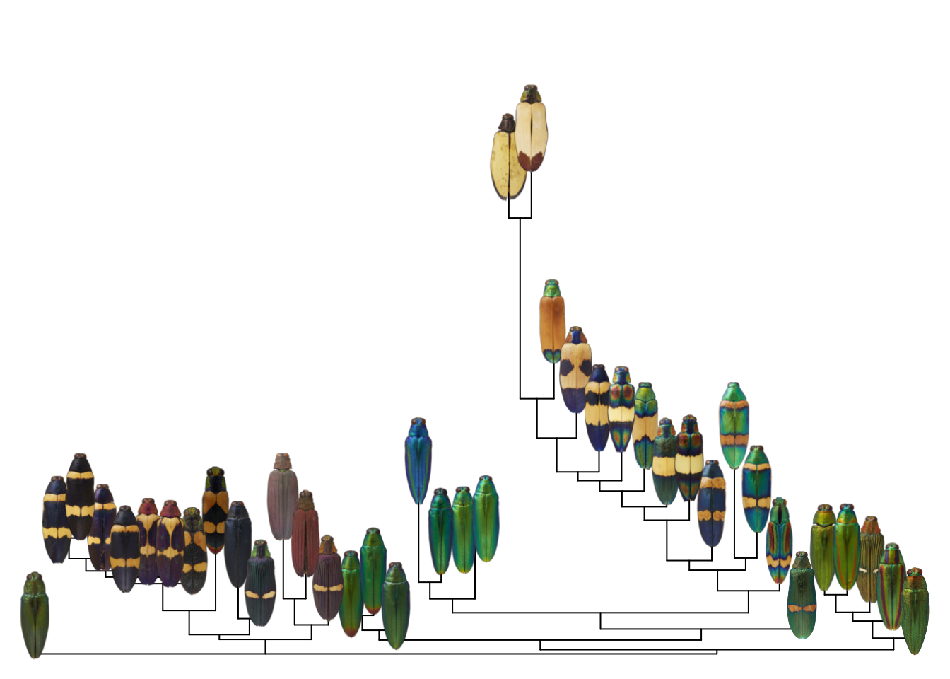
Putting it all together, all we have to do is plot the tree, then plot the images. One crucial thing here–and familiar to anyone working with trees–make sure your images are in the same order as your tips. This will save you a lot of head-scratching later.
# get image names
imnames <- tools::file_path_sans_ext(basename(images))

# get tip labels
tipnames <- tree$tip.label

# in my case, the tip labels are identical to the image names, so I can
# use these to check that my images are in the right order:
image_order <- match(tipnames, imnames)
images <- images[image_order]

# and plot!
par(mar = rep(0, 4))
plot(tree, show.tip.label = FALSE, direction = "upward")

# get the parameters from the plotting environment
lastPP <- get("last_plot.phylo", envir = .PlotPhyloEnv)

# get the xy coordinates of the tips
ntip <- lastPP$Ntip
xy <- data.frame(x = lastPP$xx[1:ntip],
                 y = lastPP$yy[1:ntip])

for (i in 1:length(images)) {
  add_image(png::readPNG(images[i]),
            x = xy[i, 1],
            y = xy[i, 2],
            width = 3)
}
At this point, I usually write a wrapper function to do all of this for me, so I can plot an image tree from a tree and a list of image paths. I also add a bit of trickery to fix the x-axis scaling; phylogenies typically have weird axis scaling.
image_tree <- function(tree, # a phylo object
                       image_paths, # a vector of image paths (in order)
                       image_width = 0.1, # image width (as a proportion of the x-axis)
                       tip_label = FALSE, # whether to draw the tip labels
                       ...) {

  require(ape)
  # plot the tree
  plot.phylo(tree, show.tip.label = tip_label, ...)

  # this is the weird part: we get the phylo plot parameters from the active
  # graphics device
  lastPP <- get("last_plot.phylo", envir = .PlotPhyloEnv)

  # get the xy coordinates of the tips
  ntip <- lastPP$Ntip
  xy <- data.frame(x = lastPP$xx[1:ntip],
                   y = lastPP$yy[1:ntip])

  # scale image width according to plot width
  image_width <- diff(range(lastPP$x.lim)) * image_width

  # add the images using the add_image function
  for (i in 1:length(image_paths)) {
    img <- recolorize::readImage(image_paths[i])
    add_image(img,
              xy[i, 1], xy[i, 2],
              width = image_width)
  }

}
I’ll save that function and the add_image function in a script file (typically called image_tree.R or similar) and source that for the relevant project, so in practice my actual workflow looks like this:
library(ape)
library(colordistance)

# get images
images <- dir("images/", full.names = TRUE)

# get distance matrix
cdm <- imageClusterPipeline(images,
                            plot.heatmap = FALSE,
                            sample.size = NULL)

# make neighbor-joining tree
tree <- nj(as.dist(cdm))

# plot image tree
par(mar = rep(0, 4))
image_tree(tree, images,
           direction = "upward",
           y.lim = c(0, 0.7))
So it’s actually pretty straightforward!
One question I would have after reading this post is: “Why don’t you just add this function to your R packages, instead of the crummy-looking default?” This is a good question, and there are two answers.
First, I didn’t know how to do this when I first wrote the colordistance package, but I did know how to make heatmaps. I assumed that anyone using the package would take a quick look at the heatmap and then export the distance matrix for further analysis and plotting to emphasize whatever was most important about their results, and it didn’t occur to me that people are pretty likely to use the default visualization because they assume that’s what the package author intended. If I ever get the time and incentive to update the package, I hope to do so.
Second, I find myself redefining or tweaking this function so much for specific use cases (for instance, in this case we just use the readPNG function because all the images are PNGs, but you would need to change this if that’s not true of your images) that I didn’t see the point of including a static version in any one package. There’s so much variability in how plots are displayed and in how images are stored and displayed that a post explaining the details of the function was more helpful than creating a static version that would be out of date or too specific in scope. For instance, the image_tree function above doesn’t try to match your image list to your tree tips, because that would require assuming your images are named the same way as your tree tips, which probably won’t usually be the case.
Anyways, there is probably a happier middle ground than what I’ve included here. Hopefully this post provides enough detail for other people to modify it for their needs!
Hannah Weller
Postdoctoral research fellow
I’m a postdoc in the Integrative Evolutionary Biology group at the University of Helsinki studying the evo-devo of fish color.