color-based image segmentation (for people with other things to do)
You can also tour the functions in the function gallery.
The recolorize package is a toolbox for making color maps, essentially color-based image segmentation, using a combination of automatic, semi-automatic, and manual procedures. It has four major goals:
Provide a middle ground between automatic segmentation methods (which are hard to modify when they don’t work well) and manual methods (which can be slow and subjective).
Be deterministic whenever possible, so that you always get the same results from the same code.
Be modular and modifiable, so that you can tailor it for your purposes.
Play nice with other color analysis tools.
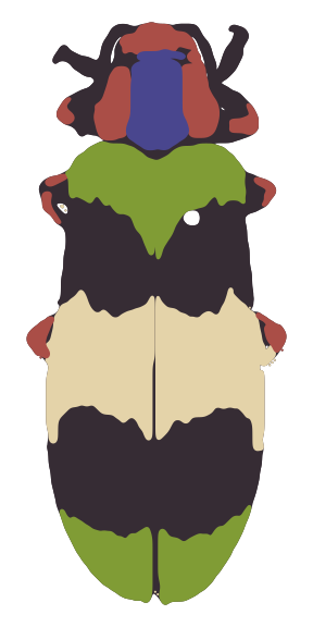
The color map above, for example, was generated using a single function which runs in a few seconds (and is deterministic):
library(recolorize)

# get the path to the image (comes with the package, so we use system.file):
img <- system.file("extdata/corbetti.png", package = "recolorize")

# fit a color map (only provided parameter is a color similarity cutoff)
recolorize_obj <- recolorize2(img, cutoff = 45)
Notice what we didn’t have to input: we didn’t have to declare how many colors we expected (5), what we expect those colors to be (red, green, blue, black, and white), which pixels to include in each color patch, or where the boundaries of those patches are.
This introduction is intended to get you up and running with the recolorize package. Ideally, after reading it, you will have enough information to start to play around with the set of tools that it provides in a way that suits what you need it to do.
I have tried not to assume too much about the reader’s background knowledge and needs, except that you are willing to use R and you have a color segmentation problem you have to solve before you can do something interesting with images. I primarily work with images of animals (beetles, fish, lizards, butterflies, snakes, birds, etc), and that will probably come through in the documentation. But it should work just as well for other kinds of images. Maybe better!
I hope that this package will be helpful to you, and that if it is, you will share it with others who might find it helpful too. I had a lot of fun discussions with a lot of interesting people while I was making it, for which I’m very grateful.
If something is unclear or you find a bug, please get in touch or file an issue on the GitHub page. Suggestions for improvements are always welcome!
Quick start
The bare minimum to start toying around with the package.
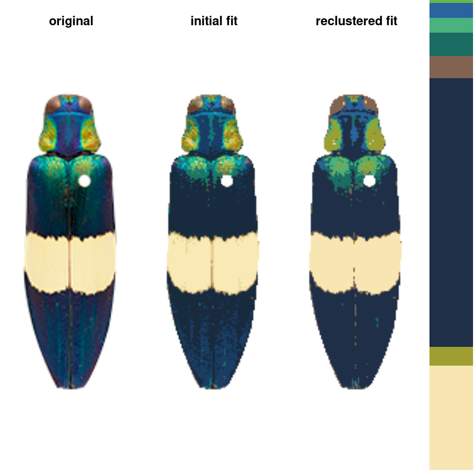
The basic recolorize workflow is initial clustering step \(\rightarrow\) refinement step \(\rightarrow\) manual tweaks.
Images should first be color-corrected and have any background masked out, ideally with transparency, as in the image above, for example (Chrysochroa corbetti, taken by Nathan P. Lord, used with permission and egregiously downsampled to ~250x150 pixels by me).
In the initial clustering step, we bin all of the pixels into (in this case) 8 total clusters:
init_fit <- recolorize(img, method = "hist", bins = 2,
                       color_space = "sRGB")
#>
#> Using 2^3 = 8 total bins

- Followed by a refinement step where we combine clusters by their similarity:
refined_fit <- recluster(init_fit, similarity_cutoff = 45)


# pretty big improvement!
The recolorize2 function above calls these functions in sequence, since they tend to be pretty effective in combination.
- Finally, we can do manual refinements to clean up the different color layers, for example absorbing the red speckles into the surrounding color patches:
absorb_red <- absorbLayer(refined_fit, layer_idx = 3,
                          size_condition = function(s) s <= 15,
                          highlight_color = "cyan")
Or performing simple morphological operations on individual layers:
final_fit <- editLayer(absorb_red, 3,
                        operation = "fill", px_size = 4)
You can also batch process images using the same parameters, although recolorize functions only deal with one image at a time, so you will have to use a for loop or define a new function to call the appropriate functions in the right order:
# get all 5 beetle images:
images <- dir(system.file("extdata", package = "recolorize"), "png", full.names = TRUE)

# make an empty list to store the results:
rc_list <- vector("list", length = length(images))

# run `recolorize2` on each image
# you would probably want to add more sophisticated steps in here as well, but you get the idea
for (i in 1:length(images)) {
  rc_list[[i]] <- suppressMessages(recolorize2(images[i], bins = 2,
                              cutoff = 30, plotting = FALSE))
}

# plot for comparison:
layout(matrix(1:10, nrow = 2))
for (i in rc_list) {
  plotImageArray(i$original_img)
  plotImageArray(recoloredImage(i))
}
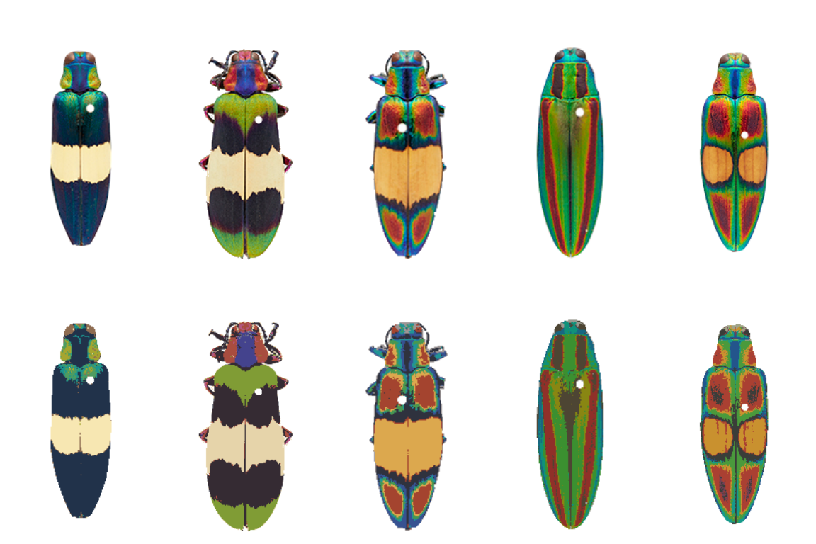
# given the variety of colors in the dataset, not too bad,
# although you might go in and refine these individually
Once you have a color map you’re happy with, you can export to a variety of formats. For instance, if I wanted to run Endler’s adjacency and boundary strength analysis in the pavo package, using human perception:
adj <- recolorize_adjacency(rc_list[[1]], coldist = "default", hsl = "default")
#> Using single set of coldists for all images.
#> Using single set of hsl values for all images.
print(adj[ , c(57:62)]) # just print the chromatic and achromatic boundary strength values
#>      m_dS     s_dS     cv_dS     m_dL     s_dL     cv_dL
#>  36.33178 11.90417 0.3276517 24.88669 17.80173 0.7153115
If you’d like a deeper explanation of each of these steps, as well as how to modify them to suit your needs, along with what else the package can do: read on!
Before you start
Color segmentation can be a real rabbit hole—that is, it can be pretty easy to become fixated on getting perfect results, or on trying to define some objective standard for what correct segmentation looks like. The problem with this mindset is that there’s no set of universal parameters that will give you perfect segmentation results for every image, because images alone don’t always contain all the relevant information: color variation due to poor lighting in one image could be just as distinct as color variation due to pattern striations in another.
The correct output for color segmentation depends on your goal: are you concerned with identifying regions of structural vs. pigmented color? Does the intensity of the stain on your slide matter, or just presence/absence? If you have a few dozen stray pixels of the wrong color in an image with hundreds of thousands of correctly categorized pixels, will that meaningfully affect your calculations?
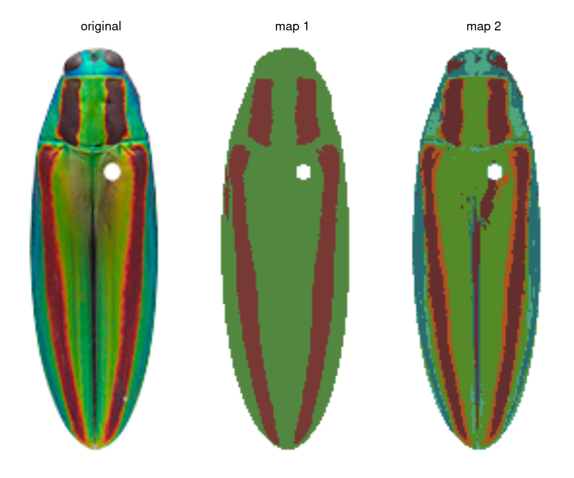
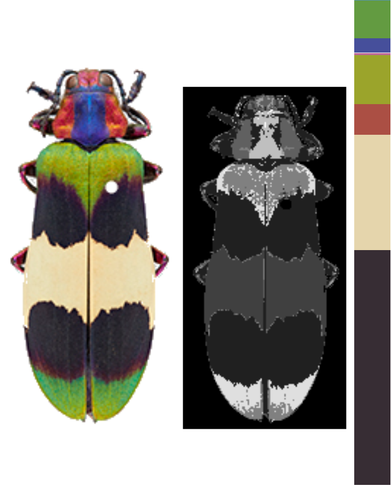
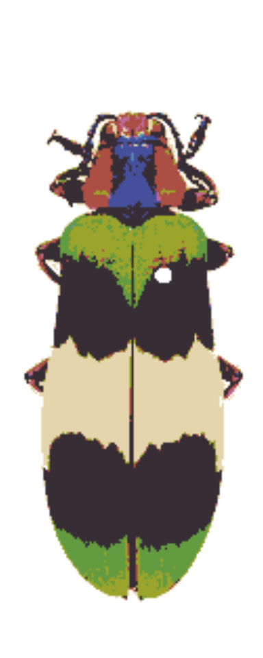
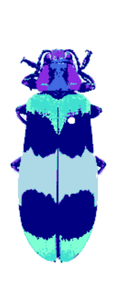
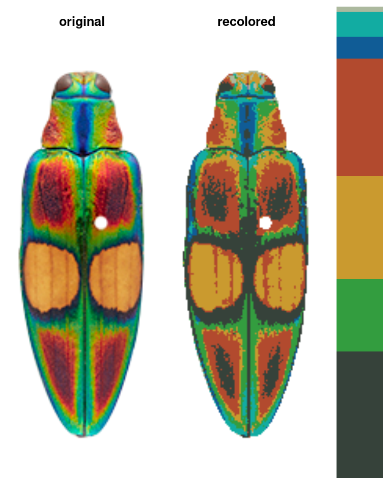
Let’s take the jewel beetle (family Buprestidae) images that come with the package as an example. If I want to segment the lefthand image (Chrysochroa fulgidissima), the solution depends on my question. If my question is “How does the placement and size of these red bands compare to that of closely related beetles?” then I really just want to separate the red bands from the rest of the body, so I would want the color map in the middle. If my question is “How much do these red bands stand out from the iridescent green base of the beetle?” then I care about the brighter orange borders of the bands, because these increase the boundary strength and overall contrast in the beetle’s visual appearance—so I would go with map 2 on the right.
So before you start, I highly recommend writing down precisely what you want to measure at the end of your analysis, to avoid becoming weighed down by details that may not matter. It will save you a lot of time.
Step 0: Image acquisition & preparation
What to do before you use recolorize.
Before we attempt image segmentation, we need segmentable images. recolorize doesn’t process your images for you beyond a few basic things like resizing, rotating, and blurring (which can help with segmentation). You should do all image processing steps which are usually necessary for getting quantitative color data, like white balance correction, gradient correction, or background removal, before inputting them to recolorize.
There are lots of software tools available for making these kinds of corrections: GIMP, FIJI/ImageJ, and even the imager package will provide options for some or all of these. If you really want to get pipeline-y, Python has a much more robust set of image processing libraries that will help with automatic color correction and background masking, which is well beyond the scope of this intro.
If you are at all concerned with sensory biology and animal vision, I highly recommend micaToolbox, which is a well-documented and comprehensive toolkit for creating images as animals see them (rather than as cameras and computers see them); see especially the instructions for creating false color cone-mapped images.
The corrections you have to make really depend on what you’re trying to do. If you just care about the regions but don’t really care about the final colors they end up being assigned, you probably don’t need to worry too much about color correction; if you’re working with histology slides, you probably don’t need to mask the background; if you have a really even and diffuse lighting setup, you probably won’t have to deal with shadows or gradients.
Background masking with transparencies
If you’re masking the background, use transparencies. This is pretty easy to do in GIMP, Photoshop, or ImageJ. The transparency layer (or alpha channel) is the fourth channel of an image (the other three being the R, G, and B channels), and recolorize treats it like a binary mask: any pixel with an alpha value of 1 is retained, and any pixel with an alpha value of < 1 is ignored. This means you don’t have to worry about finding a uniform background color that is sufficiently different from your foreground object in every image, which can otherwise be a real pain.
Using transparency is unambiguous, and has the bonus benefit of making for nicer plots, too, since you don’t have to worry about the corners of your images overlapping and blocking each other. All the images in this demo have transparent backgrounds. However, you can use the lower and upper arguments to set boundaries for excluding pixels as background based on their color (see documentation). Just know that these will be set to transparent internally.
Step 1: Loading & processing images
How to get images into R.
We can read in an image by passing the filepath to the readImage function. This is a pretty generic function (almost every image processing package in R has something similar); the recolorize version doesn’t even assign the output to a special class (so don’t try to print it).
# define image path - we're using an image that comes with the package
img_path <- system.file("extdata/corbetti.png", package = "recolorize")

# load image
img <- readImage(img_path, resize = NULL, rotate = NULL)

# it's just an array with 4 channels:
dim(img)
#> [1] 243 116   4
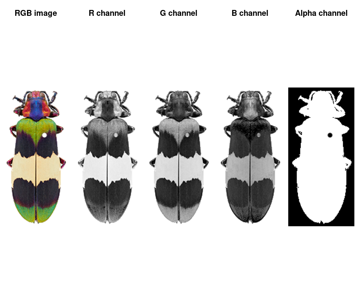
An image is a numeric array with either 3 or 4 channels (R, G, B, and optionally alpha for transparency). JPG images will only have 3 channels; PNG images will have 4. This is quite a small image (243x116 pixels) with 4 channels.
We can plot the whole array as an image, or plot one channel at a time. Notice that the red patches are bright in the R channel, same for blue-B channel, green-G channel, etc—and that the off-white patch is bright for all channels, while the black patches are dark in all channels. The alpha channel is essentially just a mask that tells us which parts of the image to ignore when processing it further.
layout(matrix(1:5, nrow = 1))
plotImageArray(img, main = "RGB image")
plotImageArray(img[ , , 1], main = "R channel")
plotImageArray(img[ , , 2], main = "G channel")
plotImageArray(img[ , , 3], main = "B channel")
plotImageArray(img[ , , 4], main = "Alpha channel")
Optionally, when you load the image, you can resize it (highly recommended for large images) and rotate it. Image processing is computationally intensive, and R is not especially good at it, so downsampling it usually a good idea. A good rule of thumb for downsampling is that you want the smallest details you care about in the image (say, spots on a ladybug) to be about 5 pixels in diameter (so if your spots have a 20 pixel diameter, you can set resize = 0.25).
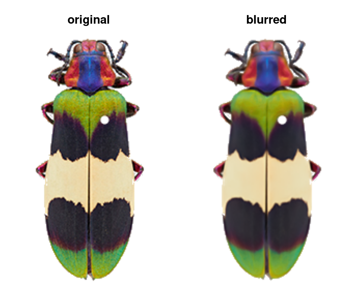
The only other thing you might do to your images before sending them to the main recolorize functions is blurImage. This is really useful for minimizing color variation due to texture (e.g. scales on a lizard, feathers on a bird, sensory hairs on an insect), and you can apply one of several smoothing algorithms from the imager package, including edge-preserving blurs:
blurred_img <- blurImage(img, blur_function = "blur_anisotropic",
                         amplitude = 10, sharpness = 0.2)
This step is optional: most of the recolorize functions will accept a path to an image as well as an image array. But once you’re happy here, we can start defining color regions!
Step 2: Initial clustering
Go from thousands of colors to a manageable number for further refinement.
The color clustering in recolorize usually starts with an initial clustering step which produces more color clusters than the final color map will have, which are then edited and combined to form the final color map. We start with an over-clustering step because it is a quick way to go from an overwhelming number of colors (256^3 unique RGB colors) to a manageable number that can be manually inspected or automatically re-clustered. You’ll usually do this using the recolorize function, which is the core of the package (go figure!):
corbetti <- system.file("extdata/corbetti.png", package = "recolorize")
recolorize_defaults <- recolorize(img = corbetti)
#>
#> Using 2^3 = 8 total bins
This function does a lot under the hood: we read in the image as an array, binned every pixel in the image into one of eight bins in RGB color space, calculated the average color of all the pixels assigned to a given bin, recolored the image to show which pixel was assigned to which color center, and returned all of that information in the recolorize_defaults object. Pretty much everything beyond this step will be a modification of one of those elements, so we’ll take a second to examine the contents of that output.
The recolorize class
Objects of S3 class recolorize are lists with several elements:
attributes(recolorize_defaults)
#> $names
#> [1] "original_img"      "centers"           "sizes"
#> [4] "pixel_assignments"
#>
#> $class
#> [1] "recolorize"
original_imgis a arastermatrix, essentially a matrix of hex color codes. This is a more lightweight version of the 3D/4D color image array we loaded earlier, and can be plotted easily by runningplot(recolorize_defaults$original_img).centersis a matrix of RGB centers (0-1 range) for each of the color patches. Their order matches the index values in thepixel_assignmentsmatrix.sizesis a vector of patch sizes, whose order matches the row order ofcenters.pixel_assignmentsis a paint-by-numbers matrix, where each pixel is coded as the color center to which it was assigned. For example, cells with a1have been assigned to the color represented by row 1 ofcenters. Background pixels are marked as 0.
If you plot the whole recolorize object, you’ll get back the plot you see above: the original image, the color map (where each pixel has been recolored), and the color palette. You can also plot each of these individually:
layout(matrix(1:3, nrow = 1), widths = c(0.45, 0.45, 0.1))
par(mar = rep(0, 4))
plot(recolorize_defaults$original_img)
plotImageArray(recolorize_defaults$pixel_assignments / 8)
plotColorPalette(recolorize_defaults$centers, recolorize_defaults$sizes,
                 horiz = FALSE)
You’ll notice this doesn’t look exactly like the function output above. Aside from some wonky scaling issues, the pixel assignment matrix plotted as a grayscale image (and we had to divide it by the number of colors in the image so it was in a 0-1 range). That’s because we didn’t tell R which colors to make each of those values, so layer 1 is the darkest color and layer 8 is the brightest color in the image.
You can get the recolored image by calling recoloredImage:
# type = raster gets you a raster (like original_img); type = array gets you an
# image array
recolored_img <- recoloredImage(recolorize_defaults, type = "array")
plotImageArray(recolored_img)
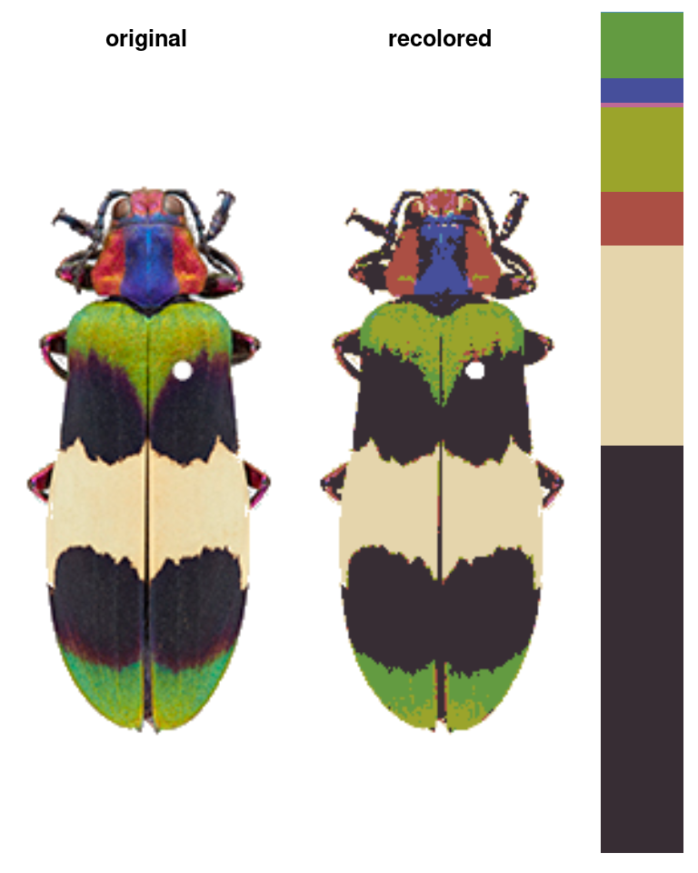
recoloredImage is just a shortcut function for constructImage, which lets you decide which colors to assign to each category in case you want to swap out the palette:
colors <- c("navy", "lightblue", "blueviolet",
            "turquoise", "slateblue", "royalblue",
            "aquamarine", "dodgerblue")
blue_beetle <- constructImage(recolorize_defaults$pixel_assignments,
               centers = t(col2rgb(colors) / 255))

# a very blue beetle indeed:
plotImageArray(blue_beetle)
Now that you have a better understanding of what these objects contain and what to do with them, we can start to unpack exactly what this function is doing.
The recolorize function
The main recolorize function has a simple goal: to take your image from a huge number of colors to a manageable number of color clusters. This falls under a category of methods for color quantization, although we have a slightly different goal here. The typical reason for doing color quantization is to simplify an image while making it look as visually similar as possible to the original; our goal is not to represent the original image, but to create a set of building blocks to combine and clean up so we can refer to whole color patches easily.
If you look at the documentation for the recolorize function, you’ll see a lot of user-specifiable parameters. There are only really 3 major ones:
- the color space in which the clustering is done (
color_space) - the clustering method (the
methodargument) - the number of color clusters (
binsformethod = histandnformethod = kmeans)
You can also map an image to an externally imposed set of colors using another function, imposeColors, which can be useful for batch processing images.
We’ll go over each of these parameters and what they do. I’ll give mild advice about how to navigate these options, but there’s a reason I’ve included all of theme here, which is that I think any combination of these parameters can be useful depending on the context.
Color spaces
Color spaces are ways to represent colors as points in multi-dimensional spaces, where each axis corresponds to some aspect of the color. You’re probably familiar with RGB (red-green-blue) color space and HSV (hue-saturation-value) color space. In RGB space, colors vary by the amount of red, green, and blue they have, where a coordinate of [0, 0, 1] would be pure blue (no red or green), [1, 1, 1] would be white, [0, 1, 1] would be cyan, etc. This is how most images are stored and displayed on computers, although it’s not always very intuitive.
The recolorize package gives you a variety of options for color spaces, but by far the two most commonly used are RGB (color_space = sRGB) and CIE Lab (color_space = Lab). CIE Lab is popular because it approximates perceptual uniformity, which means that the distances between colors in CIE Lab space are proportional to how different they actually seem to human beings. The axes represent luminance (L, 0 = black and 100 = white), red-green (a, negative values = more green and positive values = more red), and blue-yellow (b, negative values = more blue and positive values = more yellow). The idea is that something can be greenish-blue, or reddish-yellow, but not reddish-green, etc. This can be a little confusing, but the results it provides are really intuitive. For example, in RGB space, red is as similar to yellow as it is to black. In CIE Lab, red and yellow are close together, and are about equally far from black.
I’ve written in more detail about color spaces for another package here, which I would recommend reading for a more detailed overview, but let’s see what happens if we plot all of the non-background pixels from our C. corbetti example in RGB compared to CIE Lab color space (forgive the crummy plotting):
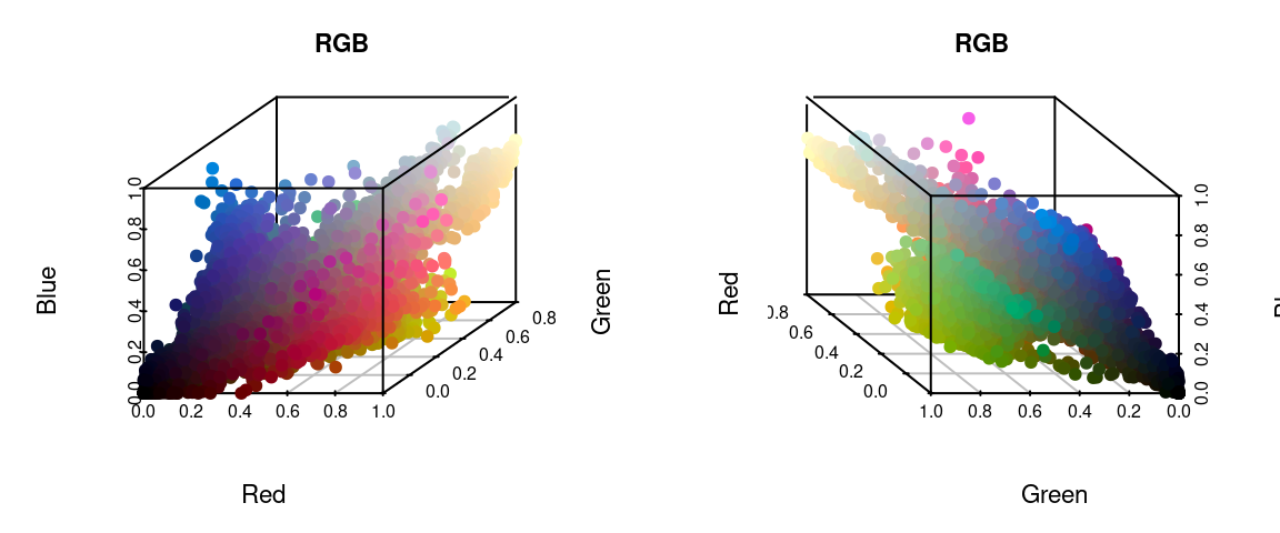
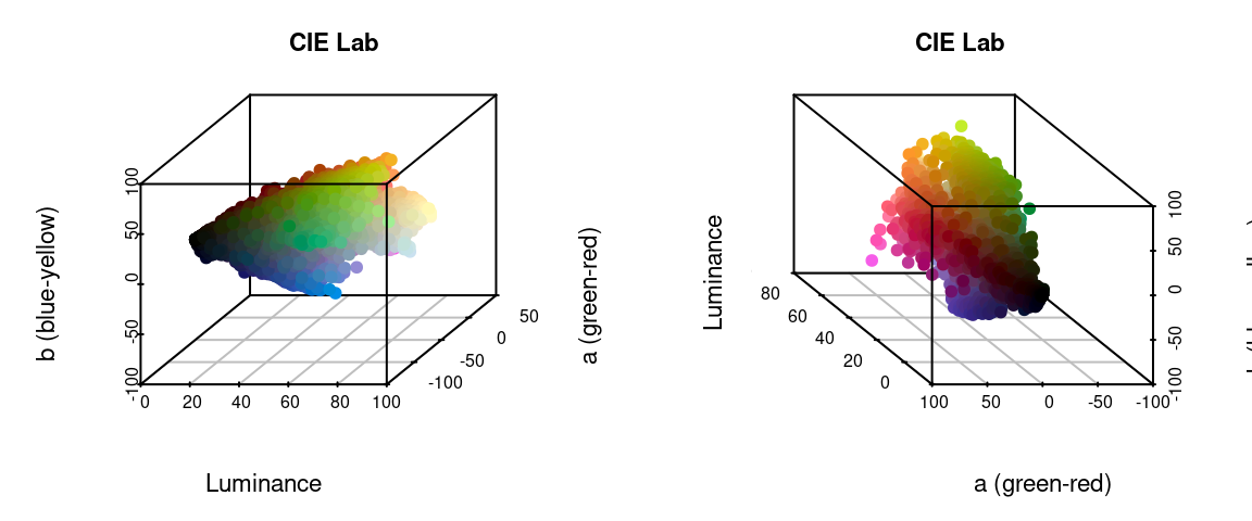
We can identify green, red, blue, black, and white pixels in both sets of plots, but their distributions are very different.
In practice, I find myself toggling between these two color spaces depending on the color distributions in my images. For example, when dealing with C. corbetti, I would use RGB, because the beetle is literally red, green, and blue. When dealing with the red and green C. fulgidissima above, I found that CIE Lab produced better results, because it separates red and green pixels by much more distance. But in general, especially as you increase the number of initial clusters, this matters less at this stage than at the refinement stage (where you can switch between color spaces again). Because CIE Lab is not evenly distributed on all axes (i.e. is not a cube), you may need to use more bins in CIE Lab space than in RGB. (Try fitting the C. corbetti image with CIE Lab space and see what happens for an idea of how much the choice of color space can matter.)
Clustering methods
The two clustering methods in recolorize are color histogram binning (fast, consistent, and deterministic) and k-means clustering (comparatively slower and heuristic, but more intuitive). The bins argument is accessed by the histogram method, and n goes with the kmeans method. I highly recommend the histogram binning unless you have a good reason not to use it, but there are good reasons to use k-means clustering sometimes.
The histogram binning method is essentially just a 3-dimensional color histogram: we divide up each channel of a color space into a predetermined number of bins, then count the number of pixels that fall into that bin and calculate their average color. So, when we divide each of 3 color channels into 2 bins, we end up with \(2^3 = 8\) total bins (which is why setting bins = 2 will produce 8 colors as above).
k-means clustering, on the other hand, is a well-known method for partitioning data into n clusters. You just provide the number of clusters you want, and it will try to find the best locations for them, where ‘best’ means minimizing the squared Euclidean distances between pixels and color centers within each cluster.
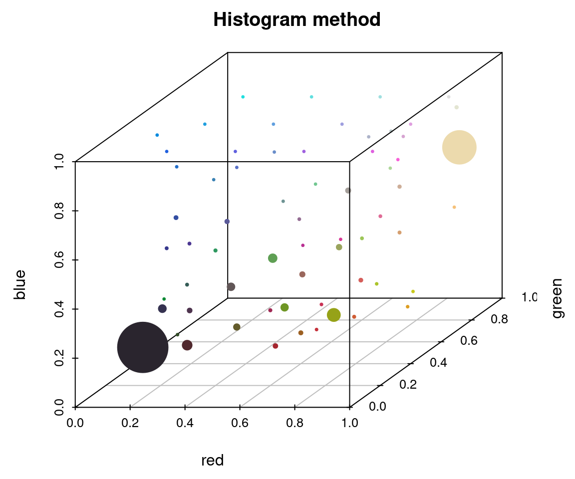
To appreciate these differences, we can fit the same number of colors (64) using the histogram method and the k-means method on the same image, then view the resulting color distributions:
# fit 64 colors, both ways
r_hist <- recolorize(img_path, method = "hist", bins = 4, plotting = FALSE)
#>
#> Using 4^3 = 64 total bins
r_k <- recolorize(img_path, method = "k", n = 64, plotting = FALSE)

plotColorClusters(r_hist$centers, r_hist$sizes, plus = .5,
                  xlab = "red", ylab = "green", zlab = "blue",
                  mar = c(3, 3, 2, 2),
                  main = "Histogram method")
plotColorClusters(r_k$centers, r_k$sizes, plus = .5,
                  xlab = "red", ylab = "green", zlab = "blue",
                  mar = c(3, 3, 2, 2),
                  main = "k-means clustering")
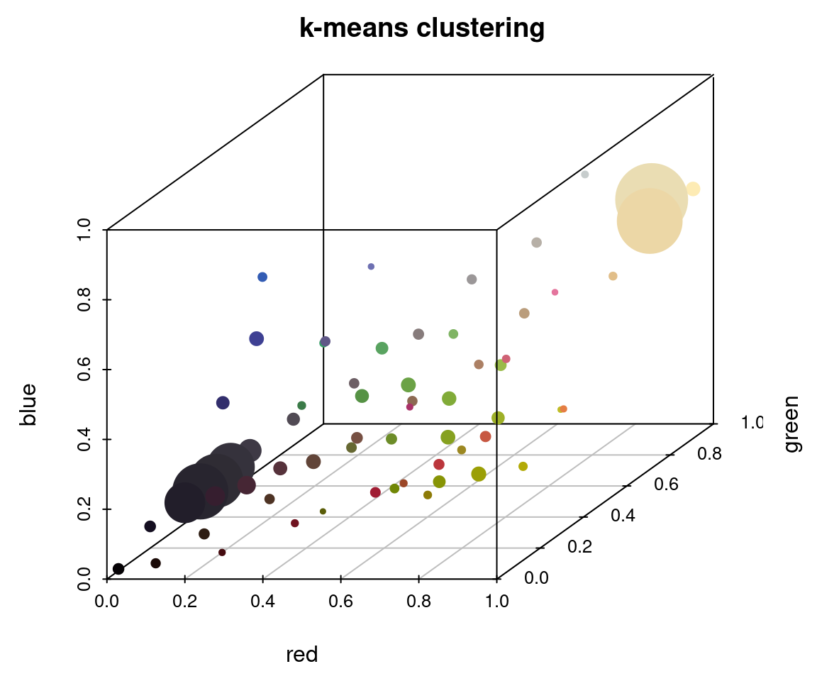
The histogram method produced a lot of tiny, nearly-empty clusters that are evenly distributed in the color space, with only a few large clusters (like the black and white ones). The k-means clustering method, on the other hand, produced a lot more medium-sized clusters, as well as splitting the black and white patches across multiple clusters.
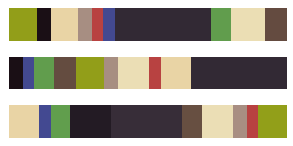
A lot of color segmentation tools will only use k-means clustering (or a similar method), because it’s relatively easy to implement and does produce good results if your images have clear color boundaries and very different colors (i.e. the pixels are far apart in color space). If you were going to stop at the initial clustering step, this would probably be a better option than the histogram binning for that reason. The main reason I recommend against it is that it is not deterministic: you will get different colors, and in a different order, every time you run it. For example, if we fit 10 colors three separate times, we get the following color palettes:
k_list <- lapply(1:3, function(i) recolorize(img_path, "k", n = 10, plotting = F))

layout(1:3)
par(mar = rep(1, 4))
lapply(k_list, function(i) plotColorPalette(i$centers, i$sizes))
#> [[1]]
#> NULL
#>
#> [[2]]
#> NULL
#>
#> [[3]]
#> NULL
The colors are similar, but not identical, and they are returned in an arbitrary order. If you run this code one day and pull out all the red clusters by their index, or merge the multiple green clusters, those values will change the next time you run the code. That and the need to specify cluster numbers for each image are more or less why I recommend not using this method unless you have a reason.
Binning the colors (histograms) is usually more viable as a first step. It’s quite fast, since we’re not really doing any clustering; the bins we assign the pixels to will be the same for every image, and we’re not calculating the distances between the pixels and their assigned color. It’s also deterministic, which means you get the same result every single time you run it. The downside is that makes this approach almost guaranteed to over-split colors, since your color regions will rarely fall cleanly within the boundaries of these bins, and many of the bins you end up with will be empty or have very few pixels.
Number of clusters
Unlike the color space and binning method, this parameter is pretty intuitive: the more clusters you fit, the more the colors in your image will be split up. It’s convenient to use the same scheme for every image in your dataset, so you might end up using whatever values are needed for your most complex image and over-splitting most of your other images. That’s usually fine, because the next set of steps will try to lump colors together or remove minor details. You want to be just granular enough to capture the details you care about, and it’s okay if some colors are split up.
One thing to note is that the bins argument allows for a different number of bins for each channel. Setting bins = 2 will divide each channel into 2 bins, but you can also set bins = c(5, 2, 2) to divide up the red channel into 5 bins and the blue and green channels into 2 bins (if in RGB space). This can be convenient if you have a lot of color diversity on only one axis, e.g. you have photographs of mammals which are shades of reddish-brown, and don’t need to waste computational time dividing up the blue channel.
# we can go from an unacceptable to an acceptable color map in
# CIE Lab space by adding a single additional bin in the luminance channel:
r_hist_2 <- recolorize(img_path, method = "hist", color_space = "Lab",
                     bins = 2)
#>
#> Using 2^3 = 8 total bins
r_hist_322 <- recolorize(img_path,
                     method = "hist",
                     bins = c(3, 2, 2))
#>
#> Using 3*2*2 = 12 bins
imposeColors()
Another option is to impose colors on an image, rather than using intrinsic image colors. Every pixel is assigned to the color it is closest to in some specified color space. Usually, this is useful for batch processing: you get colors from one image, then map them onto another image, so that the color centers correspond across all your images.
im1 <- system.file("extdata/ocellata.png", package = "recolorize")
im2 <- system.file("extdata/ephippigera.png", package = "recolorize")

# fit the first image
fit1 <- recolorize(im1)
#>
#> Using 2^3 = 8 total bins
# fit the second image using colors from the first
# adjust_centers = TRUE would find the average color of all the pixels assigned to
# the imposed colors to better match the raw image
fit2 <- imposeColors(im2, fit1$centers, adjust_centers = FALSE)
Step 3: Refinement
Using simple rules to improve the initial results.
Once we’ve reduced an image down to a tractable number of colors, we can define simple procedures for how to combine them based on similarity. recolorize (currently) comes with two of these: recluster, which merges colors by perceived similarity, and thresholdRecolor, which drops minor colors. Both are simple, but surprisingly effective. They’re also built on top of some really simple functions we’ll see in a bit, so if you need to, you can build out a similar procedure tailored to your dataset—for example, combining layers based only on their brightness values, or only combining green layers.
recluster() and recolorize2()
This is the one I use the most often, and its implementation is really simple. This function calculates the Euclidean distances between all the color centers in a recolorize object, clusters them hierarchically using hclust, then uses a user-specified cutoff to combine the most similar colors. As with recolorize, you can choose your color space, and that will make a big difference. Let’s see this in action:
recluster_results <- recluster(recolorize_defaults,
                               similarity_cutoff = 45)
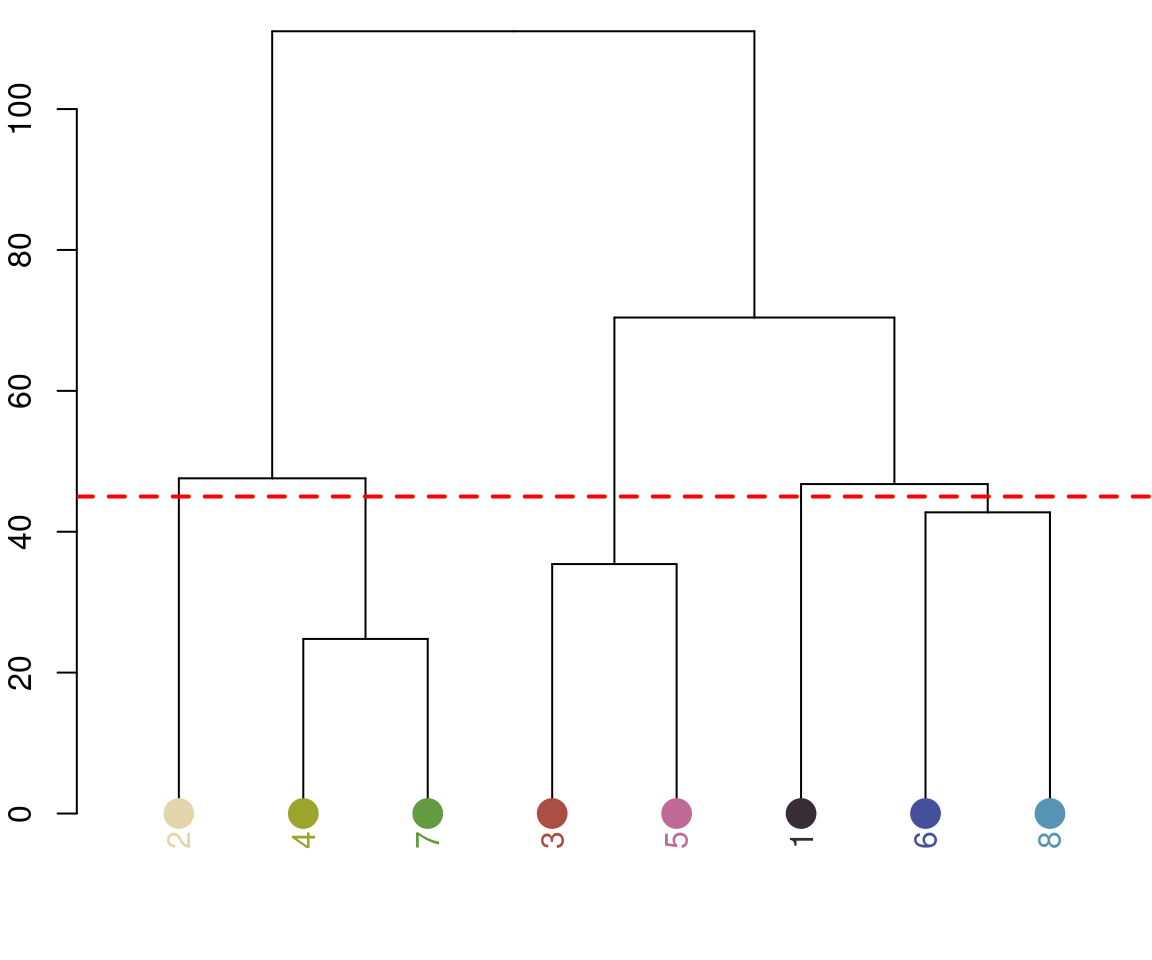

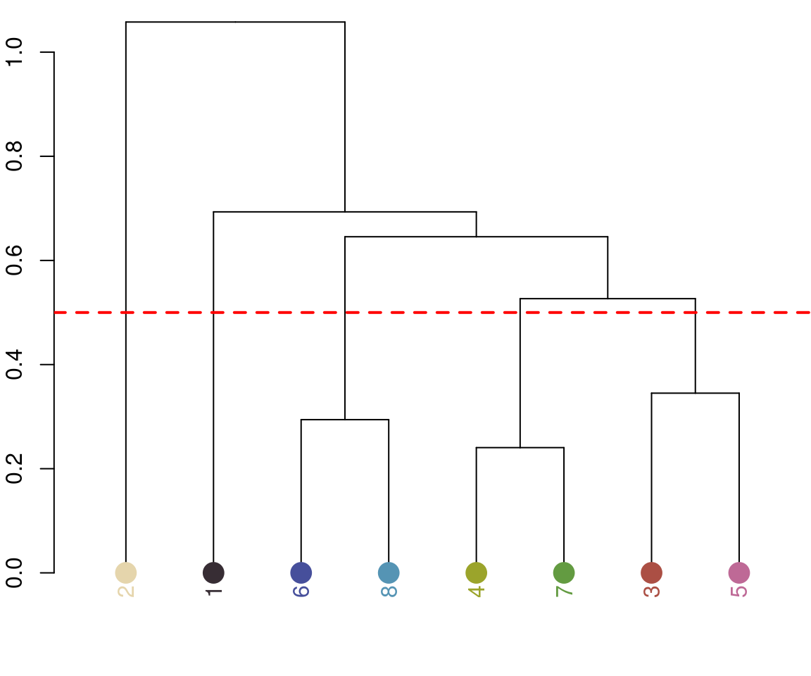
Notice the color dendrogram: it lumped together clusters 4 & 7, clusters 3 & 5, and clusters 6 & 8, because their distance was less than 45. This is in CIE Lab space; if we use RGB space, the range of distances is 0-1:
recluster_rgb <- recluster(recolorize_defaults, color_space = "sRGB",
                           similarity_cutoff = 0.5)
In this case, we get the same results, but this is always worth playing around with. Despite its simplicity, this function is highly effective at producing intuitive results. This is partly because, in only using color similarity to combine clusters, it does not penalize smaller color clusters that can still retain important details. I find myself using it so often that I included a wrapper function, recolorize2, to run recolorize and recluster sequentially in a single step:
# let's use a different image:
img <- system.file("extdata/chongi.png", package = "recolorize")

# this is identical to running:
# fit1 <- recolorize(img, bins = 3)
# fit2 <- recluster(fit1, similarity_cutoff = 50)
chongi_fit <- recolorize2(img, bins = 3, cutoff = 45)
#>
#> Using 3^3 = 27 total bins
There’s also a lot of room for modification here: this is a pretty unsophisticated rule for combining color clusters (ignoring, for example, cluster size, proximity, geometry, and boundary strength), but it’s pretty simple to write better rules if you can think of them, because the functions that are called to implement this are also exported by the package.
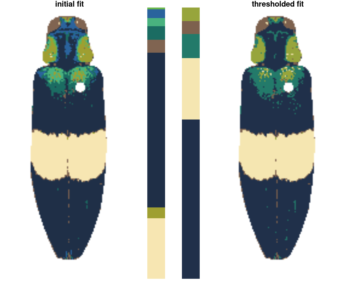
thresholdRecolor()
An even simpler rule: drop the smallest color clusters whose cumulative sum (as a proportion of total pixels assigned) is lower than some threshold, like 5% of the image. I thought this would be too simple to be useful, but every once in a while it’s just the thing, especially if you always end up with weird spurious details.
chongi_threshold <- thresholdRecolor(chongi_fit, pct = 0.1)
Step 4: Minor edits
Cleaning up the details.
These are functions that can be called individually to address problem areas in specific images, or strung together as building blocks to do more complicated operations.
absorbLayer
“Absorbs” all or part of a layer into the surrounding colors, optionally according to a size or location condition.
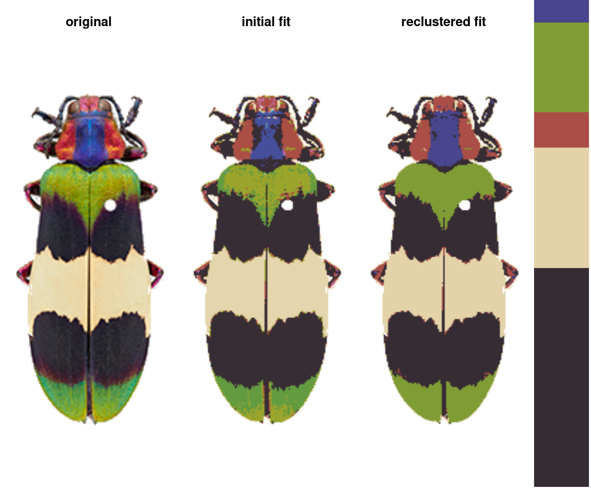
img <- system.file("extdata/fulgidissima.png", package = "recolorize")
ful_init <- recolorize2(img, bins = 3, cutoff = 60, plotting = F)
#>
#> Using 3^3 = 27 total bins
ful_absorb <- absorbLayer(ful_init, layer_idx = 3,
                          function(s) s <= 250,
                          y_range = c(0, 0.8),
                          highlight_color = "cyan")
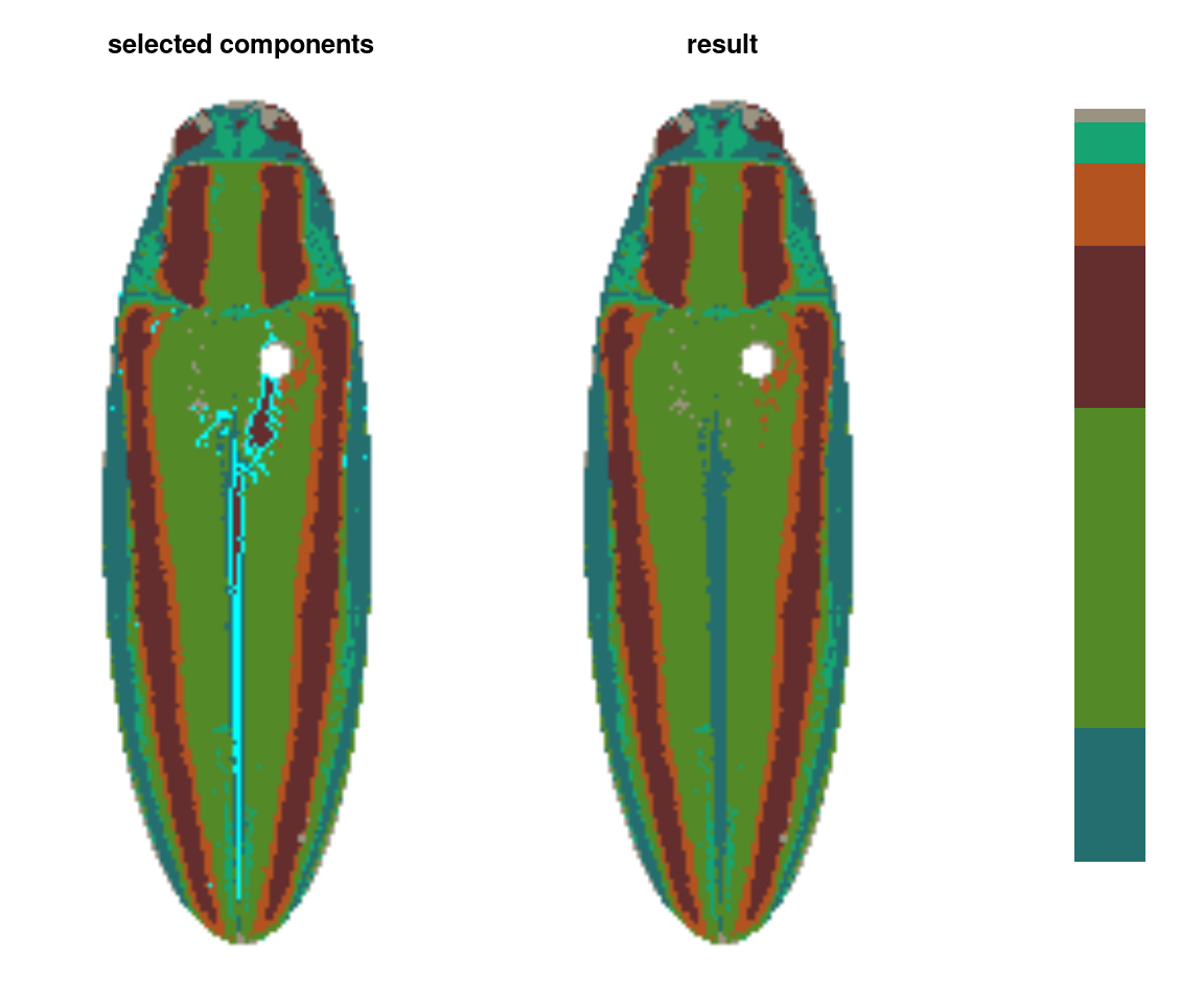
This function is really useful, but fair warning: it can be quite slow. It works by finding the color patch with which each highlighted component shares the longest border and switching the highlighted component to that color, which is more sophisticated than simply switching the patch color, but requires many more calculations. If you find yourself using this a lot, it’s a good idea to make sure you’ve downsampled your images using the resize argument.
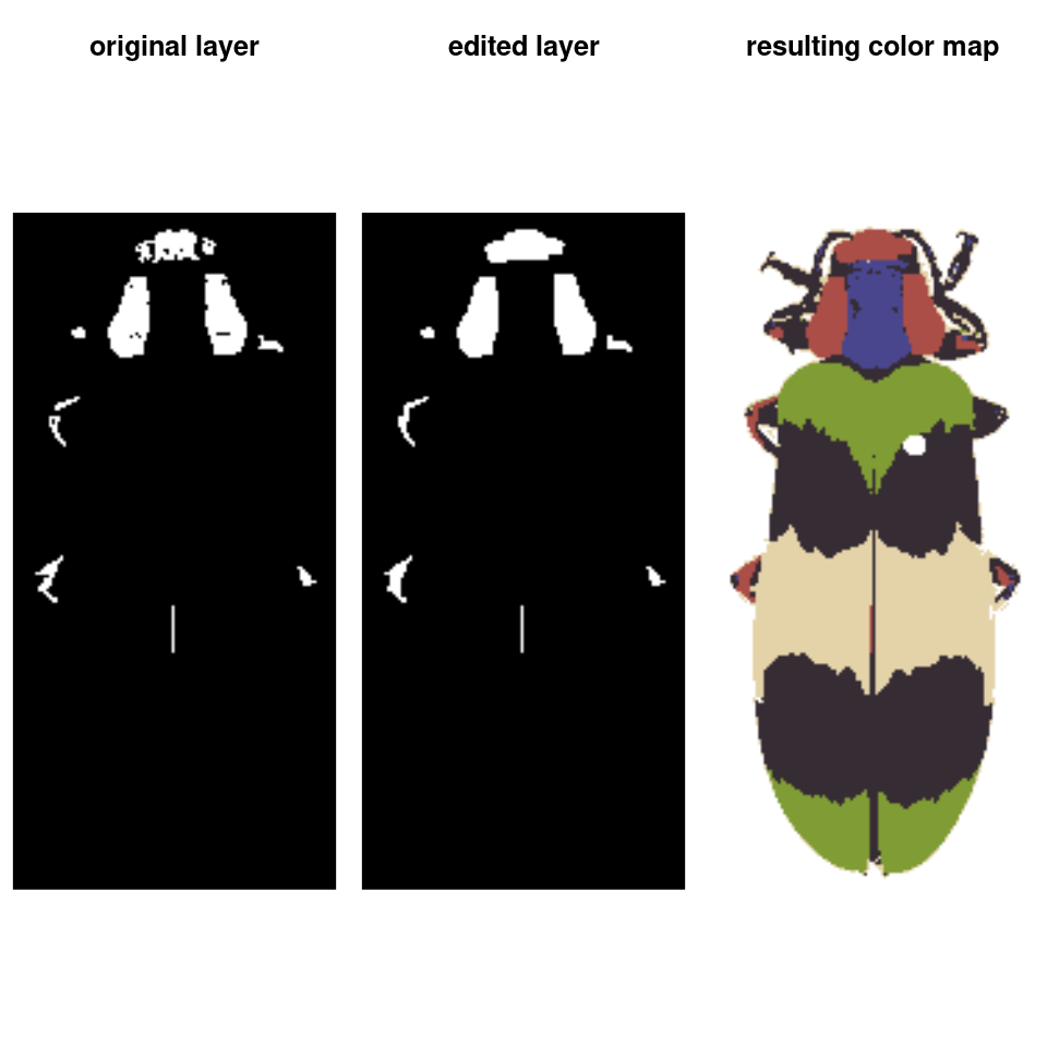
editLayer/editLayers
Applies one of several morphological operations from imager to a layer (or layers) of a recolorize object. This can be used to despeckle, fill in holes, or uniformly grow or shrink a color patch. In practice, this is mostly only useful for fixing small imperfections; anything too drastic tends to alter the overall shape of the patch.
# cleans up some of the speckles in the above output
ful_clean <- editLayers(ful_absorb, layer_idx = c(2, 5),
                        operations = "fill", px_sizes = 3, plotting = T)
This function is also easy to modify. Internally, it splits the color map into individual masks using splitByColor() (another recolorize function), then converts those to pixsets for use in imager before slotting them back in with the unchanged layers.
mergeLayers
Sometimes, you don’t want to define fancy rules for deciding which layers to combine; you just want to combine layers. That’s what this function is for. It takes in a list of numeric vectors for layers to combine (layers in the same vector are combined; those in different list elements are kept separate).
merge_fit <- mergeLayers(recolorize_defaults,
                         merge_list = list(1, 2,
                                           c(3, 5),
                                           c(4, 7),
                                           c(6, 8)))

You might notice this is a bit different than our recluster results above. That’s because internally, recluster actually uses imposeColors to refit the color map, rather than just merging layers; I have found this often produces slightly nicer results, because pixels that were on the border of one cutoff or another don’t get stranded in the wrong layer. On the other hand, mergeLayers is considerably faster.
Step 4.5: Visualizations
Making color maps is an obviously visual process, so it’s good to use visual feedback as much as possible. We’ve already seen a few of these functions in action, specifically plotColorPalette and plotImageArray, which are used in almost every function that produces a recolorize object. I’ll point out three others that I think are quite useful: imDist, plotColorClusters, and splitByColor (which also doubles as an export function).
imDist
Compares two versions of the same image by calculating the color distance between the colors of each pair of pixels (imDist), and gives you a few more options for plotting the results (imHeatmap). You can use it to get the distances between the original image and the color map:
layout(matrix(1:2, nrow = 1))

# calculates the distance matrix and plots the results
dist_original <- imDist(readImage(img),
                        recoloredImage(ful_clean), color_space = "sRGB")

# more plotting options - setting the range is important for comparing
# across images (max is sqrt(3) in sRGB space, ~120 in Lab)
imHeatmap(dist_original, viridisLite::inferno(100), range = c(0, sqrt(3)))
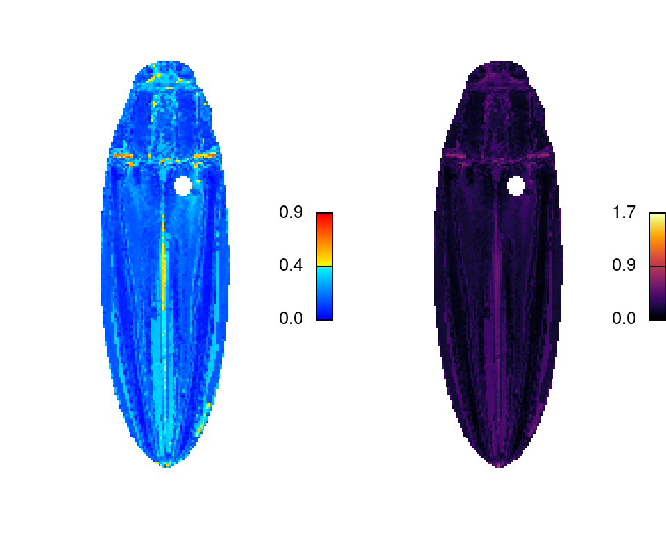
The resulting object is a simple matrix of distances between each pair of pixels in the given color space. These are essentially residuals:
hist(dist_original, main = "sRGB distances", xlab = "Distance")
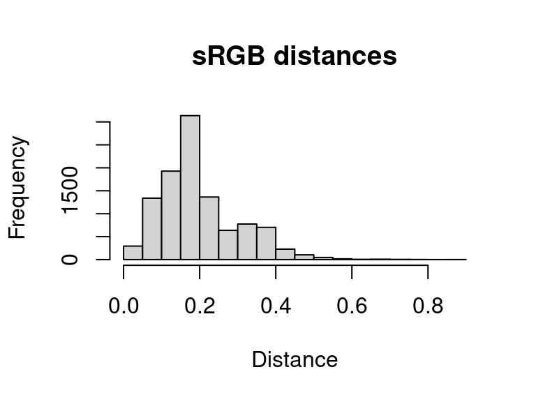
A word of warning here: it is easy to look at this and decide to come up with a procedure for automatically fitting color maps using a kind of AIC metric, trying to get the lowest SSE with the minimum set of color centers. You’re welcome to try that, but given that this is discarding spatial information, it is probably not a general solution (I haven’t had much luck with it). But there is probably some room to play here.
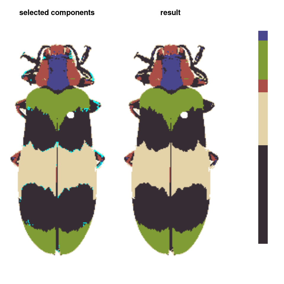
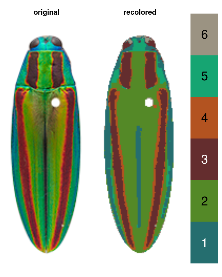
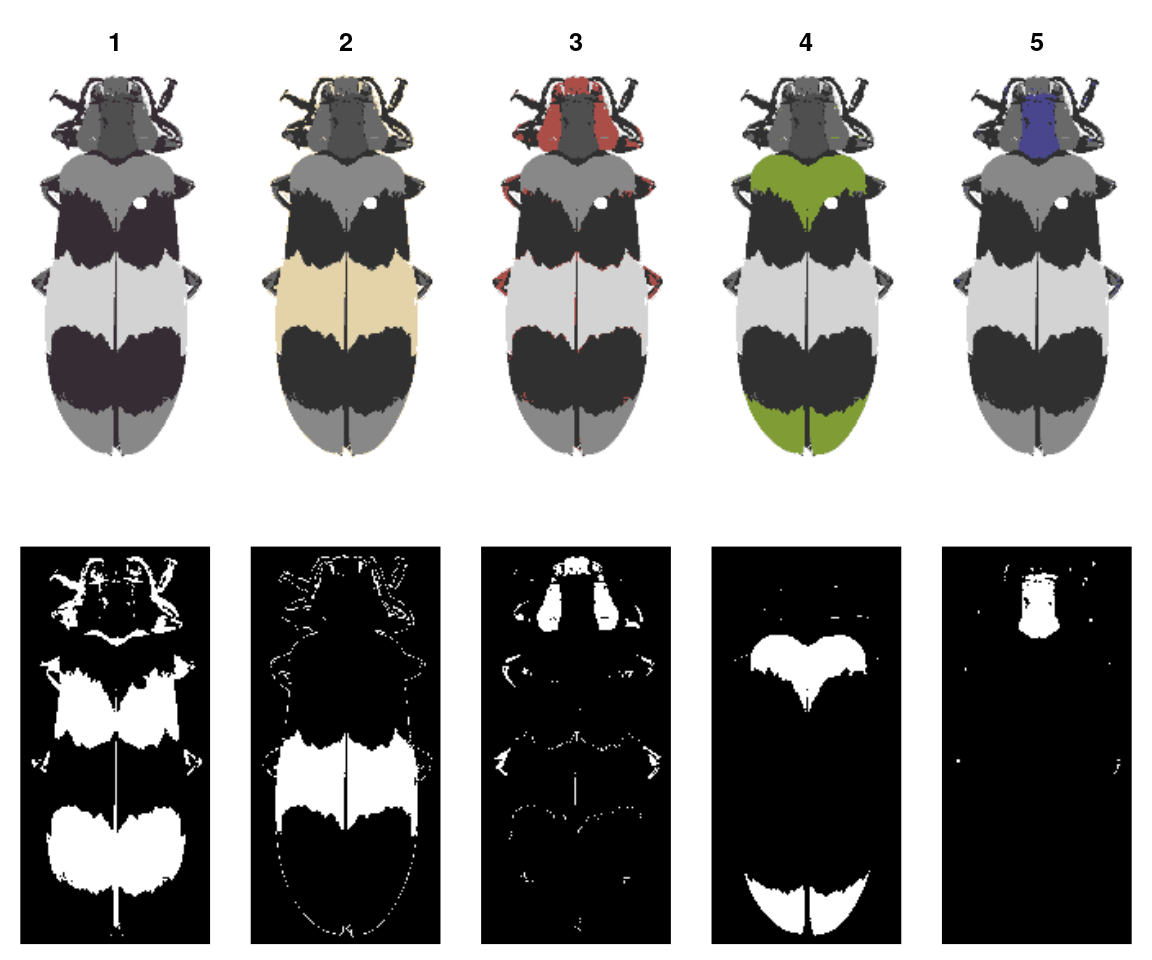
splitByColor
This is a dual-use function: by splitting up the color map into individual layers, you not only can examine the individual layers and decide whether they need any editing or merging, but you also get out a binary mask representing each layer, so you can export individual patches.
layout(matrix(1:10, nrow = 2, byrow = TRUE))

# 'overlay' is not always the clearest option, but it is usually the prettiest:
layers <- splitByColor(recluster_results, plot_method = "overlay")

# layers is a list of matrices, which we can just plot:
lapply(layers, plotImageArray)
#> [[1]]
#> [[1]]$mar
#> [1] 0 0 2 0
#>
#>
#> [[2]]
#> [[2]]$mar
#> [1] 0 0 2 0
#>
#>
#> [[3]]
#> [[3]]$mar
#> [1] 0 0 2 0
#>
#>
#> [[4]]
#> [[4]]$mar
#> [1] 0 0 2 0
#>
#>
#> [[5]]
#> [[5]]$mar
#> [1] 0 0 2 0
Step 5: Exporting
The whole point of this package is to make it easier to use other methods!
Exporting to aimges
The most direct thing you can do is simply export your recolored images as images, then pass those to whatever other tool you’d like to use, although obviously this doesn’t take full advantage of the format:
# export color map
png::writePNG(recoloredImage(recluster_results),
              target = "recolored_corbetti.png")

# export individual layers from splitByColor
for (i in 1:length(layers)) {
  png::writePNG(layers[[i]],
                target = paste0("layer_", i, ".png"))
}
pavo package
You can also convert a recolorize object to a classify object in the wonderful pavo package and then run an adjacency analysis. Bonus points if you have reflectance spectra for each of your color patches: by combining the spatial information in the color map with the coldist object generated by spectral measurements, you can run adjacency analysis for the visual system(s) of your choice right out of the box!
# convert to a classify object
as_classify <- classify_recolorize(recluster_results, imgname = "corbetti")
adj_analysis <- pavo::adjacent(as_classify, xscale = 10)

# run adjacent directly using human perceptual color distances (i.e. no spectral data - proceed with caution)
adj_human <- recolorize_adjacency(recluster_results)
You can also run an adjacency analysis with recolorize_adjacency, but only as long as you keep your skeptic hat on. This function works by calculating a coldist object right from the CIE Lab colors in the color maps, which are themselves probably derived from your RGB image, which is at best a very loose representation of how these colors appear to human eyes. The only reason this is at all reasonable is that it’s producing these values for human vision, so you will be able to see if it’s completely unreasonable. This is fine for getting some preliminary results or if you’re working with aggregate data from many sources and you’re content with specifically human (not just non-UV, but only human) vision. Otherwise, it’s probably a last resort.
patternize
Coming soon (pending a patternize update), and with many thanks to Steven van Belleghem for his help in making recolorize and patternize get along!
Some advice
This is a lot of options. How do I choose a procedure?
Most things will more or less work; if it looks reasonable, it is. Keep in mind that there is a big difference between getting slightly different color maps and getting qualitatively different results. Keep your final goal in mind. You can also try lots of different things and see if it makes a real difference.
I wish I could write a single function that would do all of these steps in the correct sequence and produce perfect results; the reason that function does not exist is because I find I have to do experiment a fair amount with every image set, and I often end up with a different order of operations depending on the problem.
Start with recolorize2 and identify the common problems you’re encountering. Does it make sense to batch process all of your images, then refine them individually? Is it better to choose a different cutoff for each image? Luckily, these functions are relatively fast, so you can test out different options.
You can also get way fancier with cutoffs than I have here. This package is built on some pretty simple scaffolding: you get a starting set of clusters, then you modify them. If you have a better/more refined way of deciding which colors to cluster, then go for it. I will soon be adding some example workflows from collaborators which should be helpful.
There is another very tempting option: make a small training set of nice color maps manually with recolorize, then use those to either fit a statistical model for other fits or use machine learning to do the rest. I think this is a really compelling idea; I just haven’t tested it yet. Maybe you want to try it out?
Can you define an optimality condition to do all the segmentation automatically?
As far as I can tell, no. This is because of the problem I pointed out at the beginning: the ‘correct’ segmentation depends on your particular question more than anything else.
How should you store the code used to generate a color map?
I like to use rlang::enexpr to capture the code I run to generate a color map, and store it as another aspect of the recolorize object, like so:
library(rlang)

# run this code, then capture it in the brackets:
steps <- {
  fit <- recolorize2(img,bins = 3, cutoff = 50)
  fit2 <- editLayers(fit, c(2, 5),
                     operations = "fill", px_sizes = 3)
  } %>% enexprs()

fit2$steps <- steps
What about batch processing?
Every function in this package operates on a single image at a time. This is because I’ve found that there is so much variation in how people go about batch processing anything: if I tried to impose what I considered to be a useful batch processing structure, within a few months I would find that it was too inflexible for some new project structure I needed to use it for. So, instead, the idea is that you can write your own batch processing functions or for loops as needed to suit your data structure. Or maybe you come up with something better than I can think of, in which case, please let me add it to the package!
What about machine learning approaches?
Using machine learning could work, but only if you already have segmented images for use in training (which presumably you had to do by hand), and making that training set could be extremely time consuming; and the amount of modification required to get a generic algorithm to work might be unjustifiable given the size of (or variance in) your image set. This problem gets a lot worse the more images we have and the more different they are, especially if you have a lot of variance in a small dataset (pretty typical in comparative biology).
That said, I don’t have much background in ML of any stripe. If you have a handy idea in this area, I would love to know about it.
Just for fun
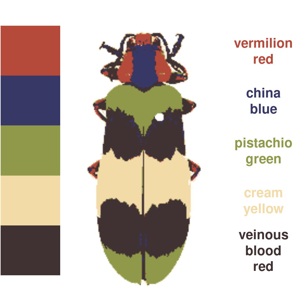
There are two fun functions in here: wernerColor and recolorizeVector.
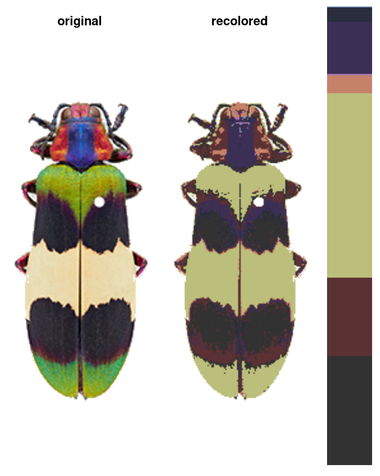
wernerColor remaps a recolorize object to the colors in Werner’s Nomenclature of Colors by Patrick Syme (1821), one of the first attempts at an objective color reference in western science, notably used by Charles Darwin. This is always fun to try out, especially given how many things get tagged as “veinous blood red” (delightful!):
rc_werner <- wernerColor(recluster_results)
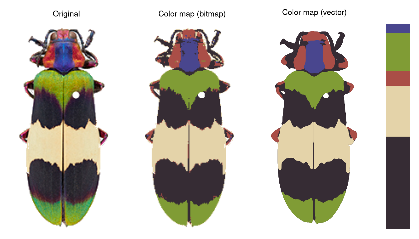
Finally, recolorizeVector converts a bitmap (i.e. pixel) image to a vector image.
rc_vector <- recolorizeVector(recluster_fit,
                              size_filter = 0.15,
                              smoothness = 5, plotting = TRUE)

# to save as an SVG:
svg(filename = "corbett_vector.svg", width = 2, height = 4)
plot(rc_vector)
dev.off()
This function is VERY experimental. If it gives you errors or looks too funky, try decreasing the size filter (which absorbs all components below some size to simplify the image) and the smoothness. Then again, sometimes you want things to look funky. If this is the case, recolorizeVector will happily enable you.